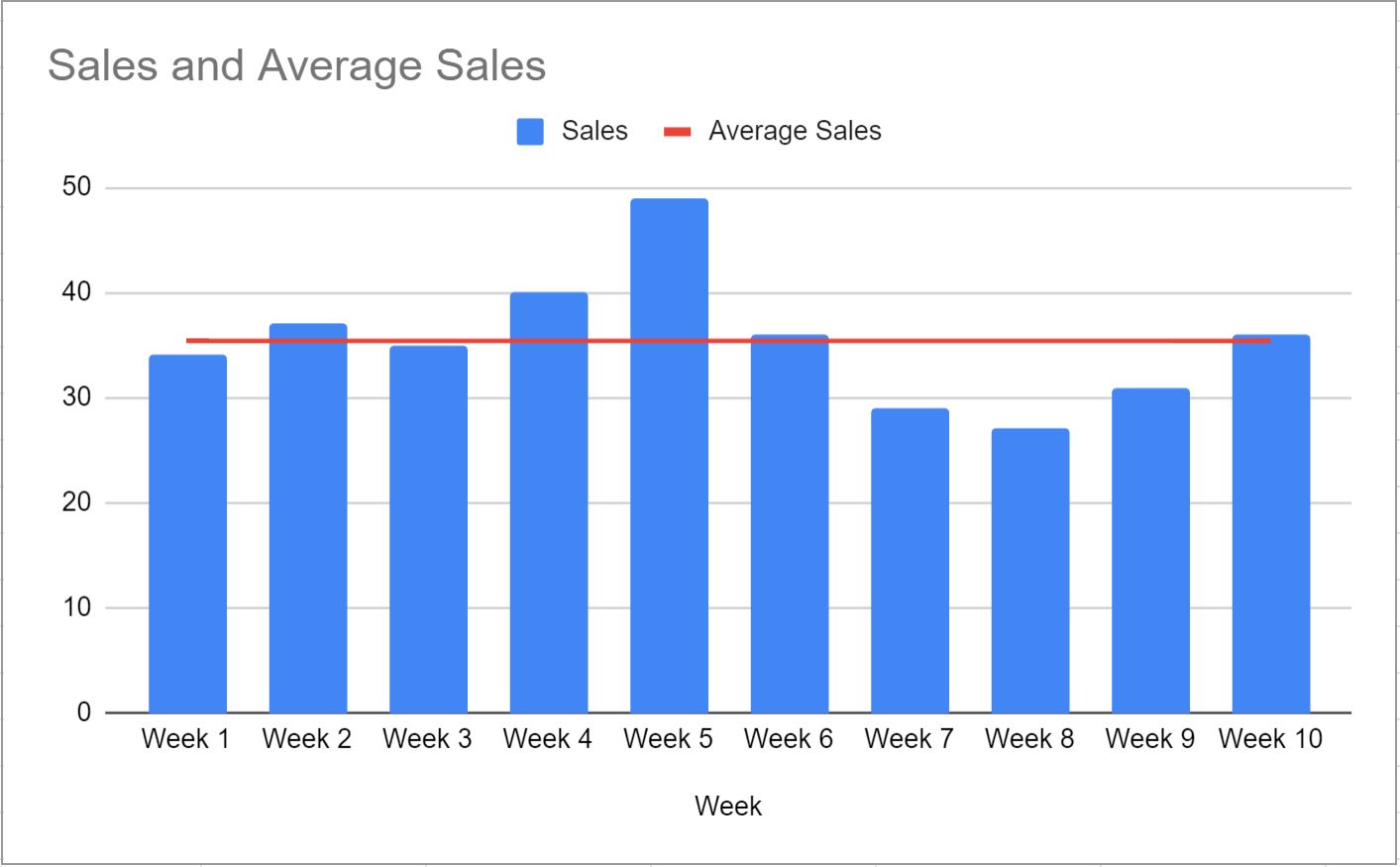
This tutorial provides a step-by-step example of how to create the following chart with an average line in Google Sheets:
Step 1: Enter the Data
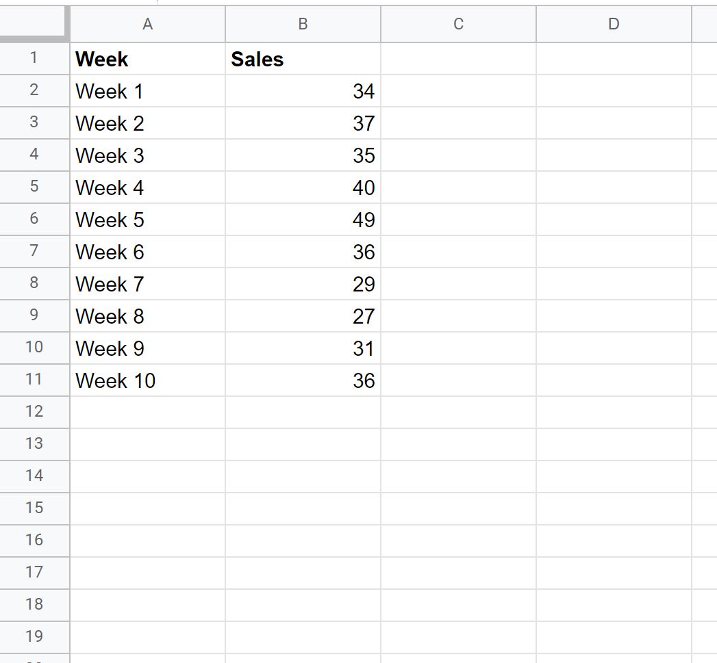
First, let’s enter the following data that shows the total sales for some company during 10 consecutive weeks:
Step 2: Calculate the Average
Next, we can type the following formula into cell C2:
=AVERAGE($B$2:$B$11)
We can then copy and paste this formula to every remaining cell in column C:
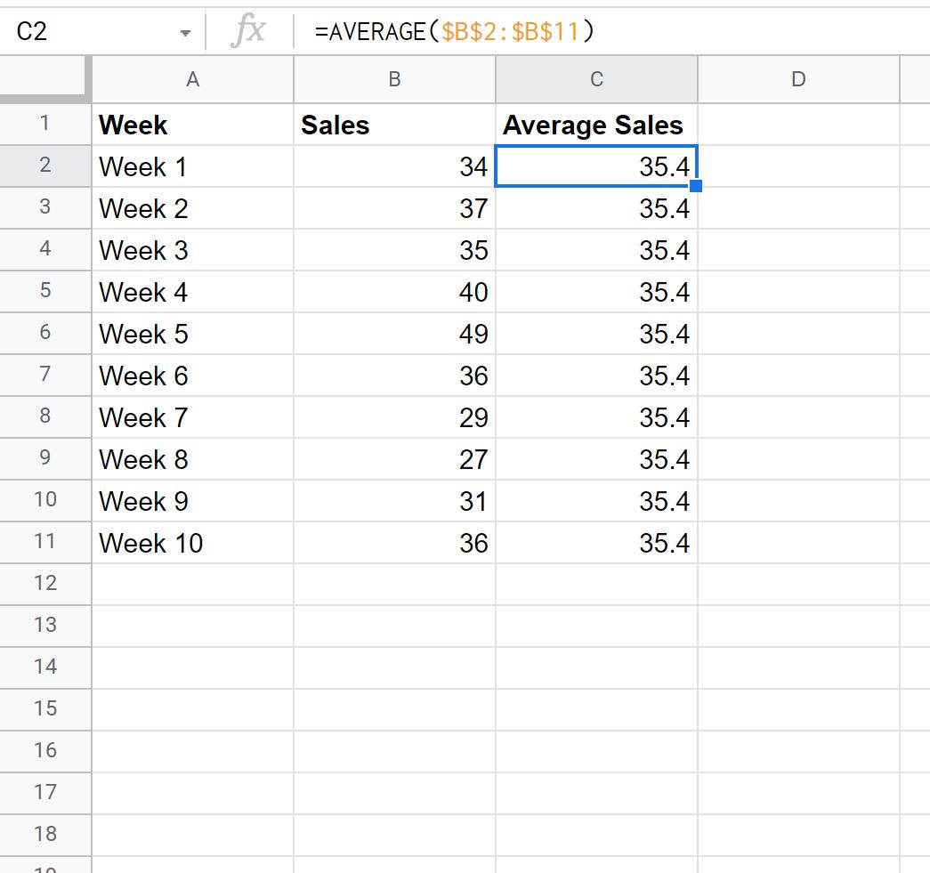
Column C now contains the average of the sales values during the 10 weeks.
Step 3: Create Chart with Average Line
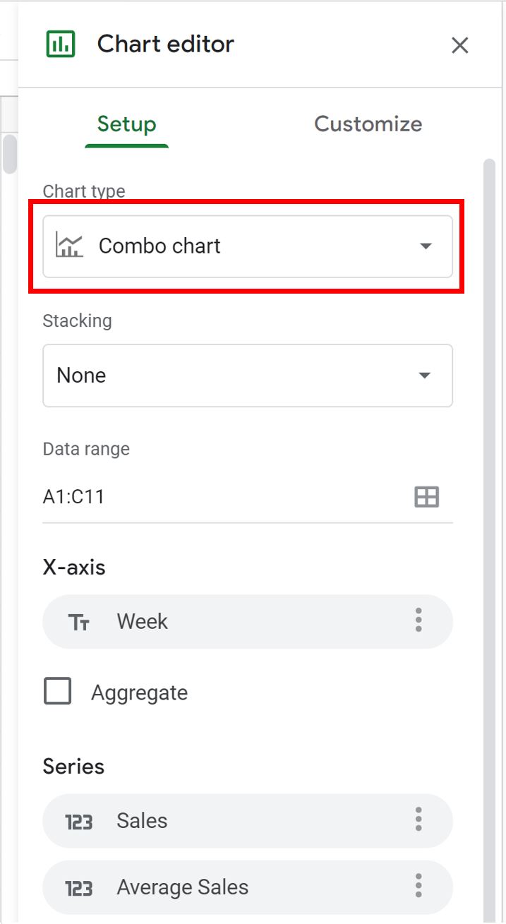
Next, highlight the cells in the range A1:C11, then click the Insert tab, then click Chart.
In the Chart editor panel that appears on the right side of the screen, click the Setup tab, then click the dropdown arrow under Chart type and choose Combo chart.
The following chart will automatically be created:
The blue bars show the sales made during each week and the red line shows the average sales made during the 10 weeks.
Additional Resources
The following tutorials explain how to create other common visualizations in Google Sheets:
How to Make a Box Plot in Google Sheets
How to Create a Pareto Chart in Google Sheets
How to Create an Area Chart in Google Sheets
How to Create a Bubble Chart in Google Sheets