In this Excel tutorial you will teach yourself how to create a chart with average line.
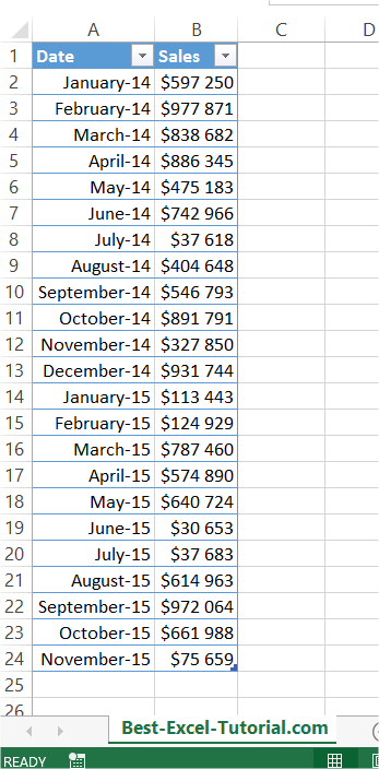
First prepare some data table.
Create another column. Calculate an average here.
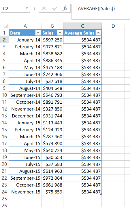
In my example formula is =AVERAGE([Sales]) or =AVERAGE($B$2:$B$24). On best-excel-tutorial.com you can learn more about Define Name and Average function.
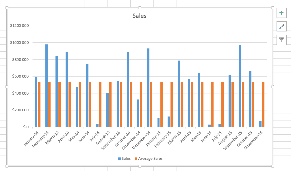
Next create a chart. I recommend Column Chart or Line Chart.
Right click the average column. From the list choose the Change Series Chart Type option.
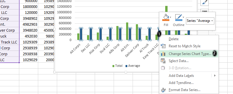
Choose Line Chart.
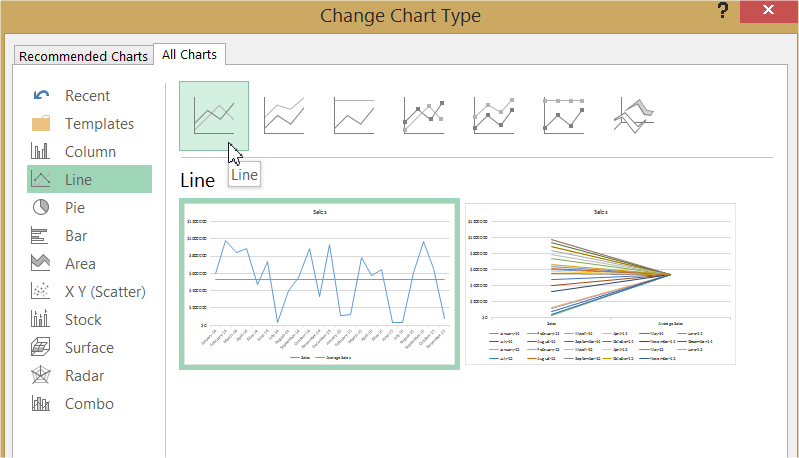
Average Line is ready.
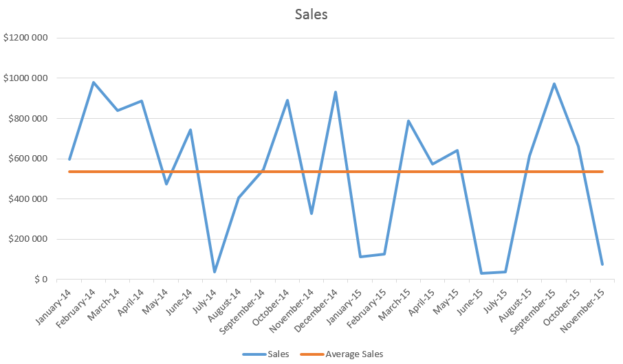
This is it. Average line on the chart could be useful to compare data with an average value.