In this Article we will create Excel charts with option buttons, It will work like when we will click the options the graph will change as per the requirements.
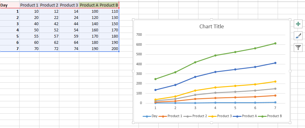
Let us start by creating chart data for the same. Now we can clearly see that there are 2 category of products. Simple graph will look like this:

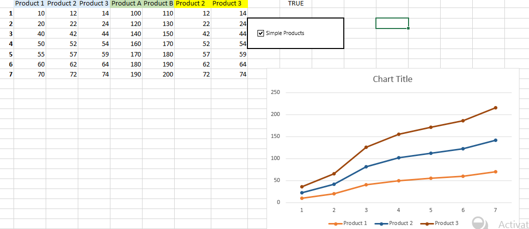
Now we will start creating the options for the same. We created new columns which have the following formulas:
=IF(J1,C1,E1)
So based on value in cell j1 it can be product2 or Products A
For based on value in cell j1 it can be product3 or Products B
So now we have added a checkbox and linked it to the cell j1 and in the graph we have changed the series types including product1 and last 2 column products which can vary.

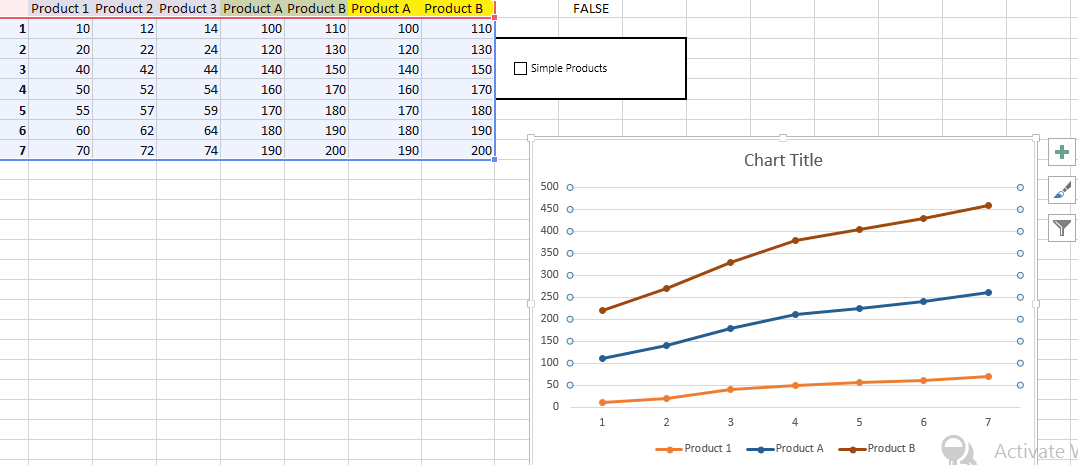
Unchecking the option:

Further reading:
Option Button
Chart with if statement
Chart with a single x-axis but two different ranges