A population pyramid is a graph that shows the age and gender distribution of a given population. It is a useful chart for easily understanding the make-up of a population as well as the current trend in population growth.
If a population pyramid has a rectangular shape, it’s an indication that a population is growing at a slower rate; older generations are being replaced by new generations of roughly the same size.
If a population pyramid has a pyramid shape, it’s an indication that a population is growing at a faster rate; older generations are producing larger new generations.
Within the chart, the gender is shown on the left and right sides, the age is shown on the y-axis, and the percentage or amount of the population is shown on the x-axis.
This tutorial explains how to create a population pyramid in R.
Creating a Population Pyramid in R
Suppose we have the following dataset that shows the percentage make-up of a population according to age (0 to 100 years) and gender(M = “Male”, F = “Female”):
#make this example reproducible
set.seed(1)

#create data frame
data #add population variable
data$population #convert population variable to percentage
data$population #view first six rows of dataset
head(data)

#  age gender population
#1   1      M   2.424362
#2   2      M   1.794957
#3   3      M   1.589594
#4   4      M   1.556063
#5   5      M   1.053662
#6   6      M   1.266231
We can create a basic population pyramid for this dataset using the ggplot2 library:
#load ggplot2
library(ggplot2)

#create population pyramid
ggplot(data, aes(x = age, fill = gender,
                 y = ifelse(test = gender == "M",
                            yes = -population, no = population))) +
  geom_bar(stat = "identity") +
  scale_y_continuous(labels = abs, limits = max(data$population) * c(-1,1)) +
  coord_flip()

Adding Titles & Labels
We can add both titles and axis labels to the population pyramid using the labs() argument:
ggplot(data, aes(x = age, fill = gender,
                 y = ifelse(test = gender == "M",
                            yes = -population, no = population))) +
  geom_bar(stat = "identity") +
  scale_y_continuous(labels = abs, limits = max(data$population) * c(-1,1)) +
  labs(title = "Population Pyramid", x = "Age", y = "Percent of population") +
coord_flip() 
Modifying the Colors
We can modify the two colors used to represent the genders by using the scale_colour_manual() argument:
ggplot(data, aes(x = age, fill = gender,
                 y = ifelse(test = gender == "M",
                            yes = -population, no = population))) +
  geom_bar(stat = "identity") +
  scale_y_continuous(labels = abs, limits = max(data$population) * c(-1,1)) +
  labs(title = "Population Pyramid", x = "Age", y = "Percent of population") +
  scale_colour_manual(values = c("pink", "steelblue"),
                      aesthetics = c("colour", "fill")) +
coord_flip() 
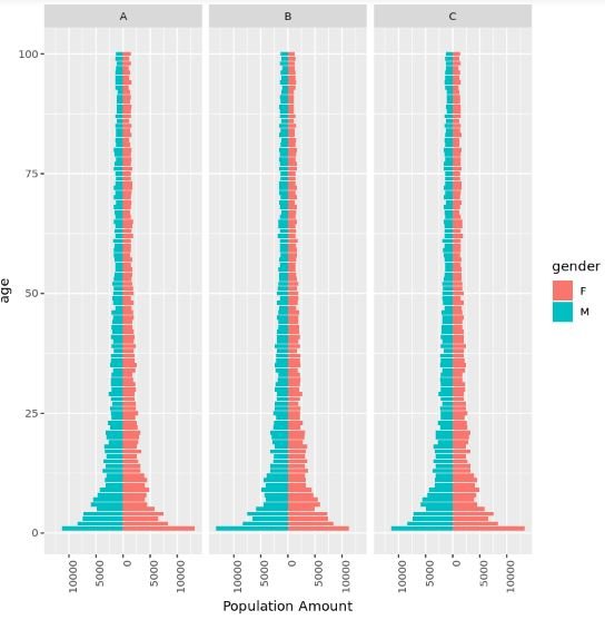
Multiple Population Pyramids
It’s also possible to plot several population pyramids together using the facet_wrap() argument. For example, suppose we have demographic data for countries A, B, and C. The following code illustrates how to create one population pyramid for each country:
#make this example reproducible
set.seed(1)

#create data frame
data_multiple #add population variable
data_multiple$population #view first six rows of dataset
head(data_multiple)

#  age gender country population
#1   1      M       A      11328
#2   2      M       A       8387
#3   3      M       A       7427
#4   4      M       A       7271
#5   5      M       A       4923
#6   6      M       A       5916

#create one population pyramid per country
ggplot(data_multiple, aes(x = age, fill = gender,
                          y = ifelse(test = gender == "M",
                                     yes = -population, no = population))) +
  geom_bar(stat = "identity") +
  scale_y_continuous(labels = abs, limits = max(data_multiple$population) * c(-1,1)) +
  labs(y = "Population Amount") +
  coord_flip() +
  facet_wrap(~ country) +
  theme(axis.text.x = element_text(angle = 90, hjust = 1)) #rotate x-axis labels
Modifying the Theme
Lastly, we can modify the theme of the charts. For example, the following code uses theme_classic() to give the charts a more minimalist look:
ggplot(data_multiple, aes(x = age, fill = gender,
                          y = ifelse(test = gender == "M",
                                     yes = -population, no = population))) +
  geom_bar(stat = "identity") +
  scale_y_continuous(labels = abs, limits = max(data_multiple$population) * c(-1,1)) +
  labs(y = "Population Amount") +
  coord_flip() +
  facet_wrap(~ country) +
  theme_classic() +
  theme(axis.text.x = element_text(angle = 90, hjust = 1))
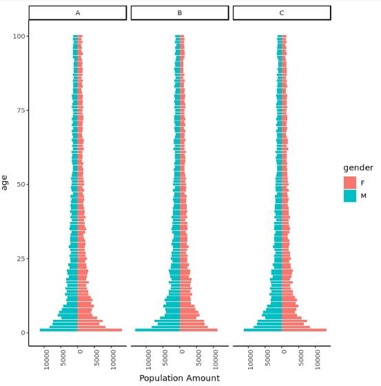
Or you can use custom ggthemes. For a complete list of ggthemes, check out the documentation page.