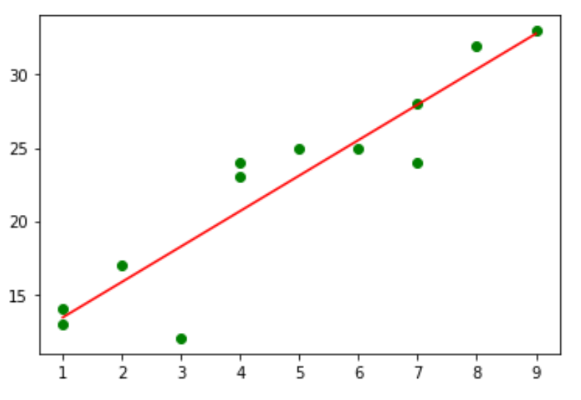
Often when you perform simple linear regression, you may be interested in creating a scatterplot to visualize the various combinations of x and y values along with the estimation regression line.
Fortunately there are two easy ways to create this type of plot in Python. This tutorial explains both methods using the following data:
import numpy as np

#create data
x = np.array([1, 1, 2, 3, 4, 4, 5, 6, 7, 7, 8, 9])
y = np.array([13, 14, 17, 12, 23, 24, 25, 25, 24, 28, 32, 33])
Method 1: Using Matplotlib
The following code shows how to create a scatterplot with an estimated regression line for this data using Matplotlib:
import matplotlib.pyplot as plt

#create basic scatterplot
plt.plot(x, y, 'o')

#obtain m (slope) and b(intercept) of linear regression line
m, b = np.polyfit(x, y, 1)

#add linear regression line to scatterplot
plt.plot(x, m*x+b)

Feel free to modify the colors of the graph as you’d like. For example, here’s how to change the individual points to green and the line to red:
#use green as color for individual points
plt.plot(x, y, 'o', color='green')

#obtain m (slope) and b(intercept) of linear regression line
m, b = np.polyfit(x, y, 1)

#use red as color for regression line
plt.plot(x, m*x+b, color='red')

Method 2: Using Seaborn
You can also use the regplot() function from the Seaborn visualization library to create a scatterplot with a regression line:
import seaborn as sns

#create scatterplot with regression line
sns.regplot(x, y, ci=None)

Note that ci=None tells Seaborn to hide the confidence interval bands on the plot. You can choose to show them if you’d like, though:
import seaborn as sns

#create scatterplot with regression line and confidence interval lines
sns.regplot(x, y)

You can find the complete documentation for the regplot() function here.
Additional Resources
How to Perform Simple Linear Regression in Python
How to Create a Residual Plot in Python
