Often you may want to create Matplotlib plots with log scales for one or more axes. Fortunately Matplotlib offers the following three functions for doing so:
- Matplotlib.pyplot.semilogx() – Make a plot with log scaling on the x-axis.
- Matplotlib.pyplot.semilogy() – Make a plot with log scaling on the y-axis.
- Matplotlib.pyplot.loglog() – Make a plot with log scaling on both axes.
This tutorial explains how to use each of these functions in practice.
Example 1: Log Scale for the X-Axis
Suppose we create a line chart for the following data:
import matplotlib.pyplot as plt

#create data
x = [1, 8, 190, 1400, 6500]
y = [1, 2, 3, 4, 5]

#create line chart of data
plt.plot(x,y)

We can use the .semilogx() function to convert the x-axis to a log scale:
plt.semilogx() 
Note that the y-axis is the exact same, but the x-axis is now on a log scale.
Example 2: Log Scale for the Y-Axis
Suppose we create a line chart for the following data:
import matplotlib.pyplot as plt

#create data
x = [1, 2, 3, 4, 5]
y = [1, 8, 190, 1400, 6500]

#create line chart of data
plt.plot(x,y)

We can use the .semilogy() function to convert the y-axis to a log scale:
plt.semilogy() 
Note that the x-axis is the exact same, but the y-axis is now on a log scale.
Example 3: Log Scale for Both Axes
Suppose we create a line chart for the following data:
import matplotlib.pyplot as plt

#create data
x = [10, 200, 3000, 40000, 500000]
y = [30, 400, 5000, 60000, 750000]

#create line chart of data
plt.plot(x,y)

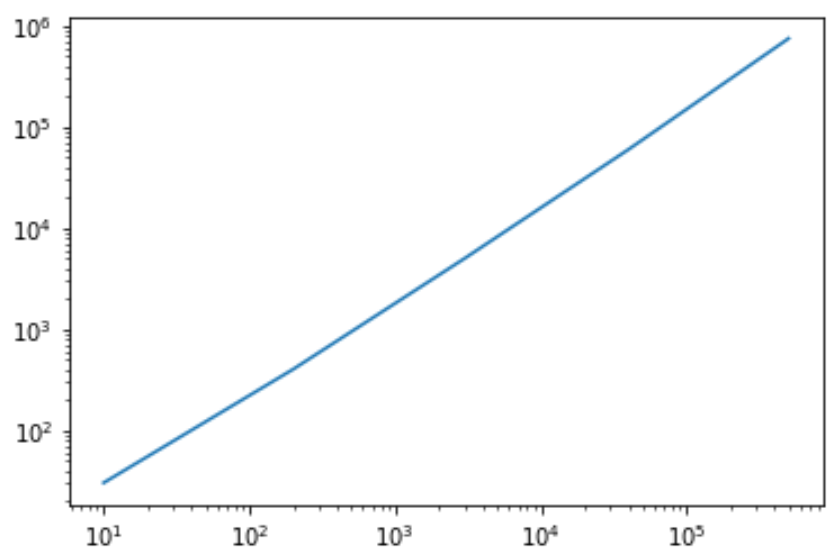
We can use the .loglog() function to convert the y-axis to a log scale:
plt.loglog(x, y) 
Note that both axes are now on a log scale.
Additional Resources
How to Change Font Sizes on a Matplotlib Plot
How to Remove Ticks from Matplotlib Plots
