A normal probability plot can be used to determine if the values in a dataset are roughly normally distributed.
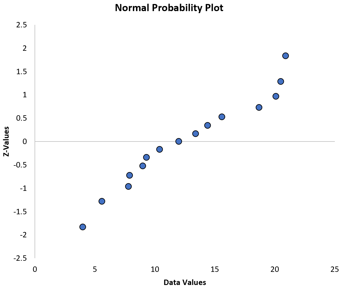
This tutorial provides a step-by-step example of how to create a normal probability plot for a given dataset in Excel
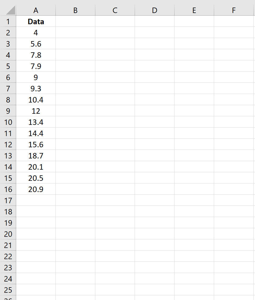
Step 1: Create the Dataset
First, let’s create a fake dataset with 15 values:
Step 2: Calculate the Z-Values
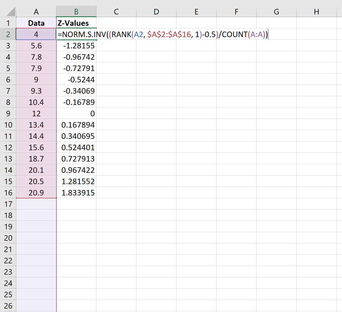
Next, we’ll use the following formula to calculate the z-value that corresponds to the first data value:
=NORM.S.INV((RANK(A2, $A$2:$A$16, 1)-0.5)/COUNT(A:A))
We’ll copy this formula down to each cell in column B:
Step 3: Create the Normal Probability Plot
Next, we’ll create the normal probability plot.
First, highlight the cell range A2:B16 as follows:
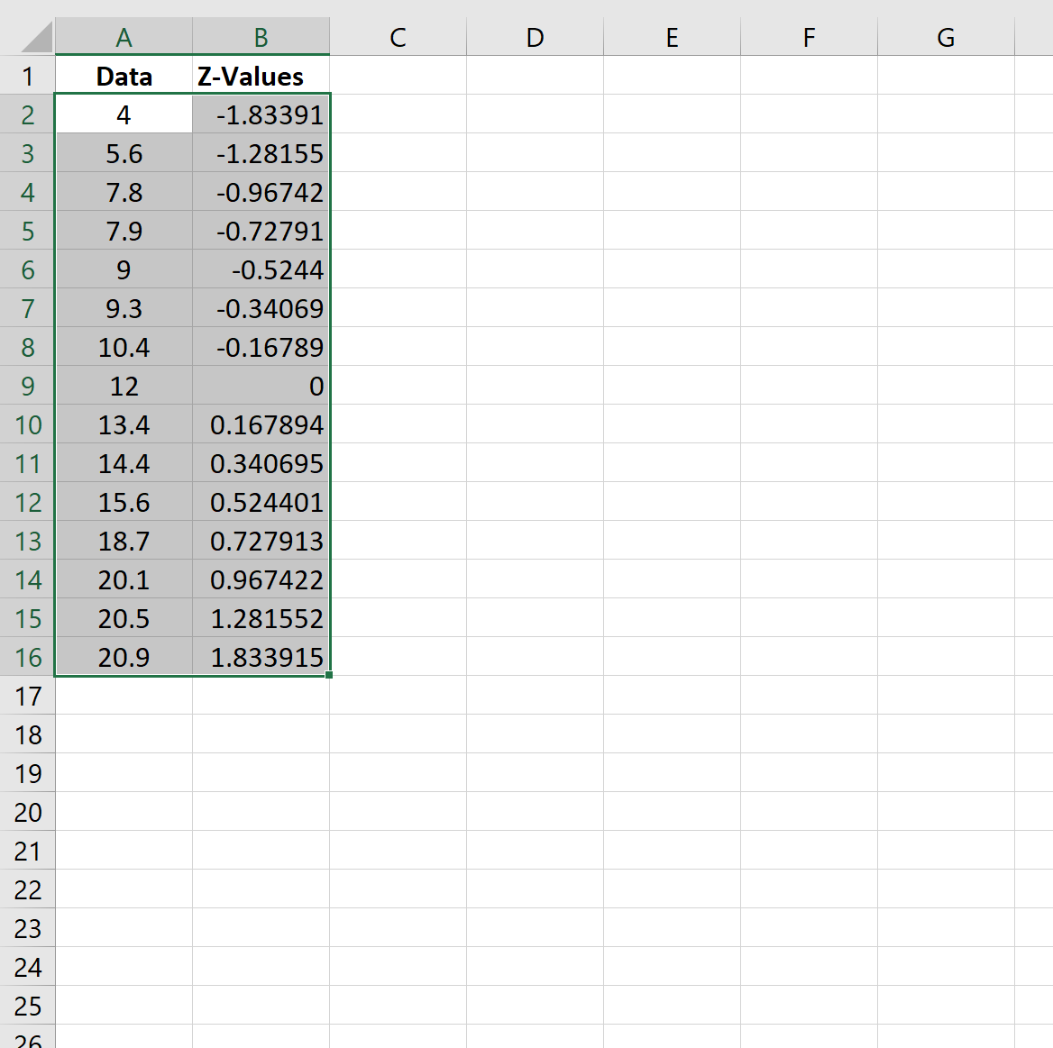
Along the top ribbon, click the Insert tab. Under the Charts section, click the first option under Scatter.
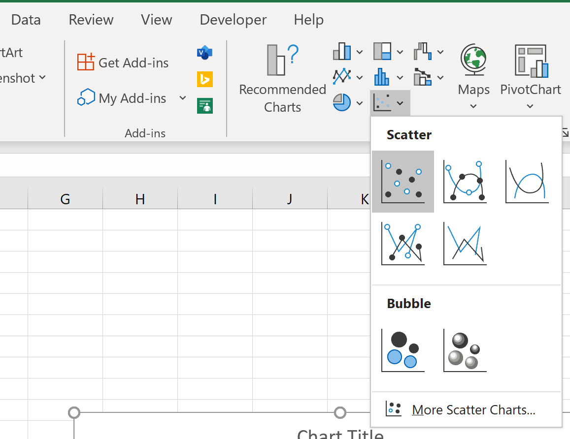
This automatically produces the following chart:
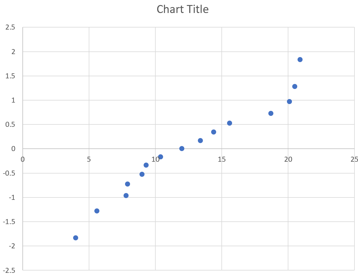
The x-axis displays the ordered data values and the y-value displays their corresponding z-values.
Feel free to modify the title, axes, and labels to make the plot more aesthetically pleasing:

How to Interpret a Normal Probability Plot
The way to interpret a normal probability plot is simple: if the data values fall along a roughly straight line at a 45-degree angle, then the data is normally distributed.
In our plot above we can see that the values tend to deviate from a straight line at a 45-degree angle, especially on the tail ends. This likely indicates that the data is not normally distributed.
Although a normal probability plot isn’t a formal statistical test, it offers an easy way to visually check whether or not a data set is normally distributed.
If you’re looking for a formal normality test, read this tutorial on how to perform a normality test in Excel.
Additional Resources
How to Make a Bell Curve in Excel
How to Make a Frequency Polygon in Excel
How to Create a Log-Log Plot in Excel
