A Q-Q plot, short for “quantile-quantile” plot, is used to assess whether or not a set of data potentially came from some theoretical distribution.
In most cases, this type of plot is used to determine whether or not a set of data follows a normal distribution.
If the data is normally distributed, the points in a Q-Q plot will lie on a straight diagonal line.
Conversely, the more the points in the plot deviate significantly from a straight diagonal line, the less likely the set of data follows a normal distribution.
The following examples show how to create Q-Q plots in R to check for normality.
Example 1: Q-Q Plot for Normal Data
The following code shows how to generate a normally distributed dataset with 200 observations and create a Q-Q plot for the dataset in R:
#make this example reproducible
set.seed(1)

#create some fake data that follows a normal distribution
data #create Q-Q plot
qqnorm(data)
qqline(data)

We can see that the points lie mostly along the straight diagonal line with some minor deviations along each of the tails.
Based on this plot, we could safely assume that this set of data is normally distributed.
Example 2: Q-Q Plot for Non-Normal Data
The following code shows how to create a Q-Q plot for a dataset that follows an exponential distribution with 200 observations:
#make this example reproducible
set.seed(1)

#create some fake data that follows an exponential distribution
data #create Q-Q plot
qqnorm(data)
qqline(data)
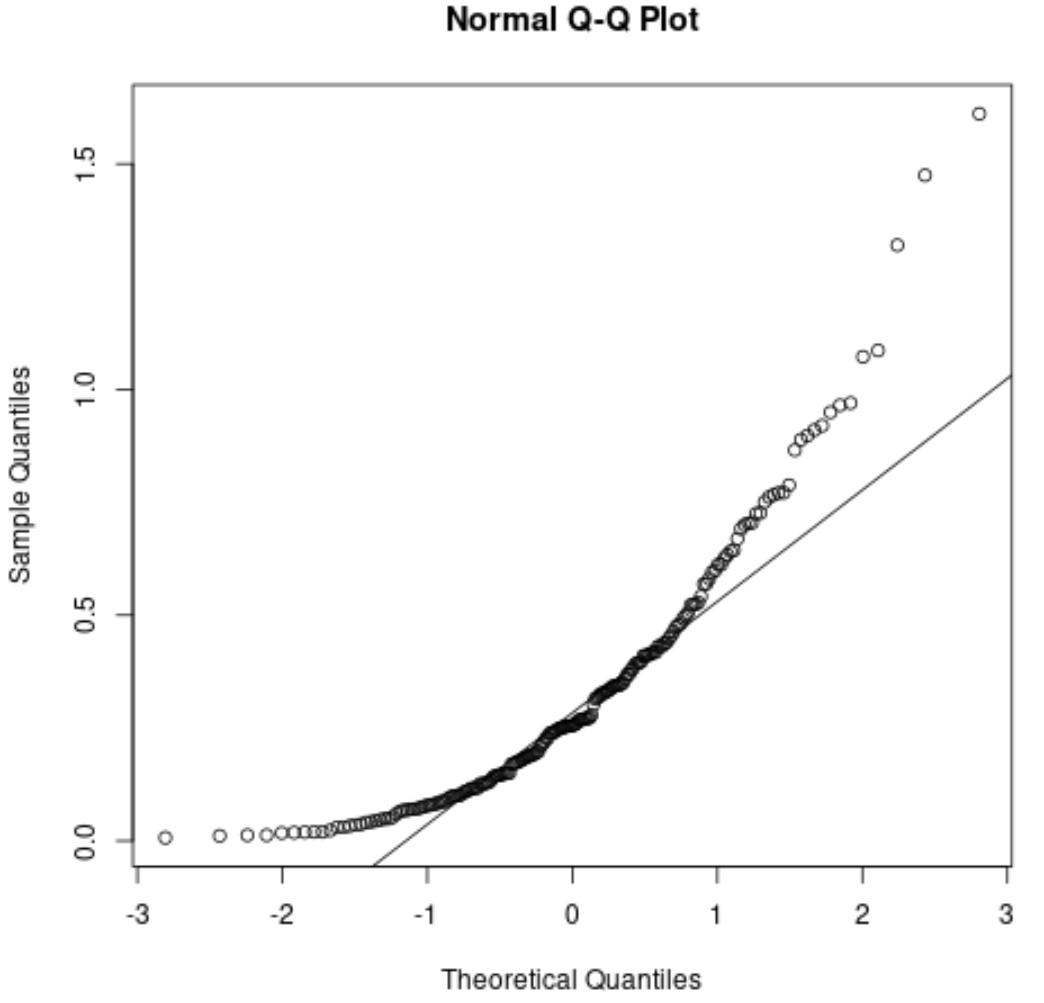
We can see that the points deviate significantly from the straight diagonal line. This is a clear indication that the set of data is not normally distributed.
This should make sense considering we specified that the data should follow an exponential distribution.
Q-Q Plots vs. Histograms
It’s worth noting that Q-Q plots are a way to visually check whether or not a dataset follows a normal distribution.
Another way to visually check for normality is to create a histogram of the dataset. If the data roughly follows a bell curve shape in the histogram, then we can assume that the dataset is normally distributed.
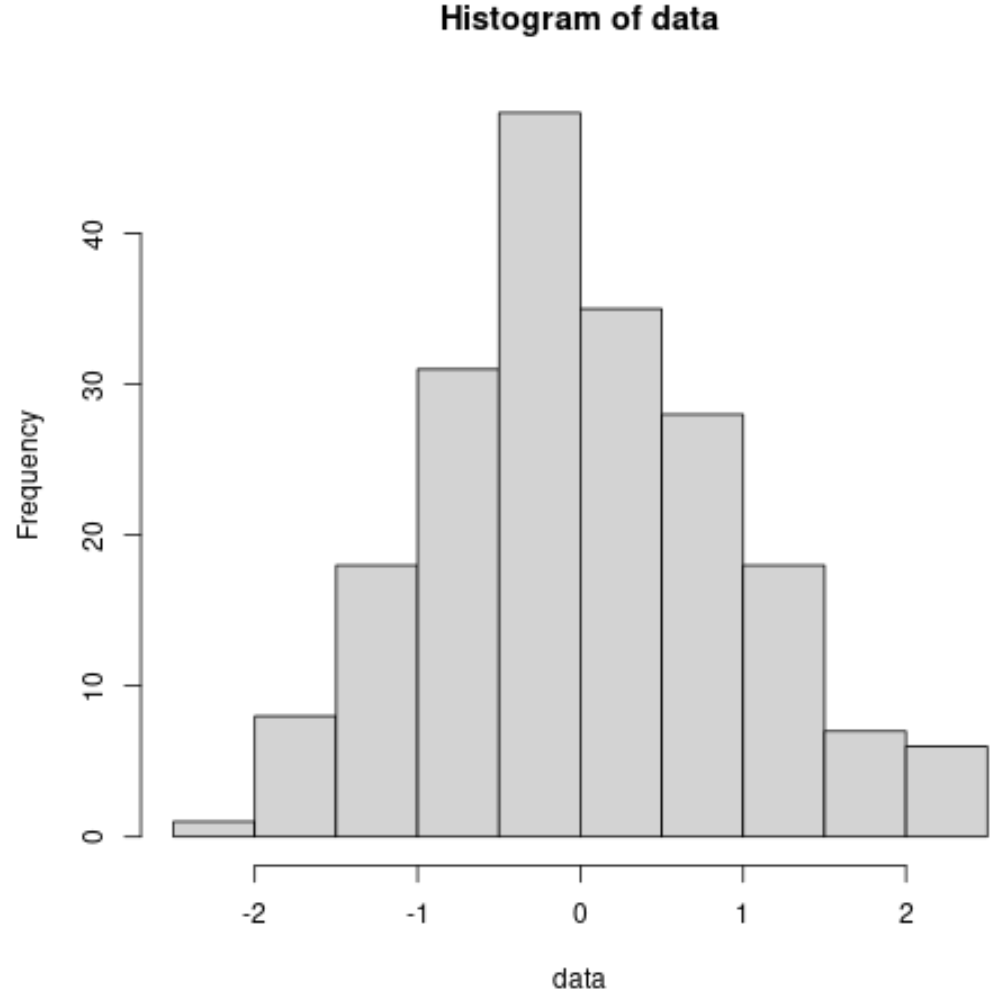
For example, here’s how to create a histogram for the normally distributed dataset from earlier:
#make this example reproducible
set.seed(1)

#create some fake data that follows a normal distribution
data #create a histogram to visualize the distribution
hist(data)
And here’s how to create a histogram for the dataset that follows an exponential distribution from earlier:
#make this example reproducible
set.seed(1)

#create some fake data that follows an exponential distribution
data #create a histogram to visualize the distribution
hist(data)
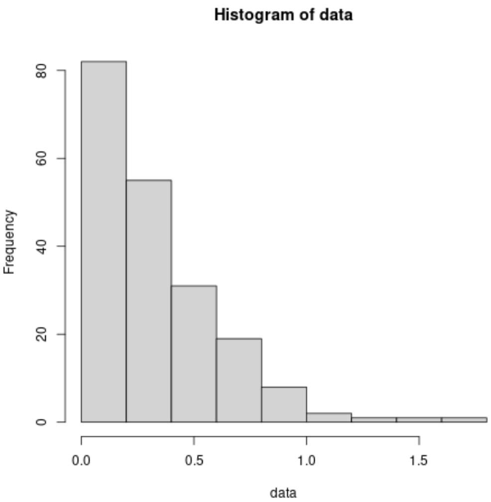
We can see that the histogram does not resemble a bell curve at all, which clearly indicates that the data does not follow a normal distribution.
Additional Resources
What is the Assumption of Normality in Statistics?
How to Create a Q-Q Plot in R
How to Create a Q-Q Plot in Excel
How to Create a Q-Q Plot in Python