You can use the following syntax to set the axis breaks for the y-axis and x-axis in ggplot2:
#set breaks on y-axis
scale_y_continuous(limits = c(0, 100), breaks = c(0, 50, 100))

#set breaks on y-axis
scale_x_continuous(limits = c(0, 10), breaks = c(0, 2, 4, 6, 8, 10))
The following examples show how to use this syntax in practice with the following data frame:
#create data frame
df frame(x=c(1, 2, 4, 5, 7, 8, 9, 10),
                 y=c(12, 17, 27, 39, 50, 57, 66, 80))

#view data frame
df

   x  y
1  1 12
2  2 17
3  4 27
4  5 39
5  7 50
6  8 57
7  9 66
8 10 80
Example 1: Set Y-Axis Breaks
The following code shows how to create a simple scatterplot using ggplot2:
library(ggplot2)

#create scatterplot of x vs. y
ggplot(df, aes(x=x, y=y)) +
  geom_point()

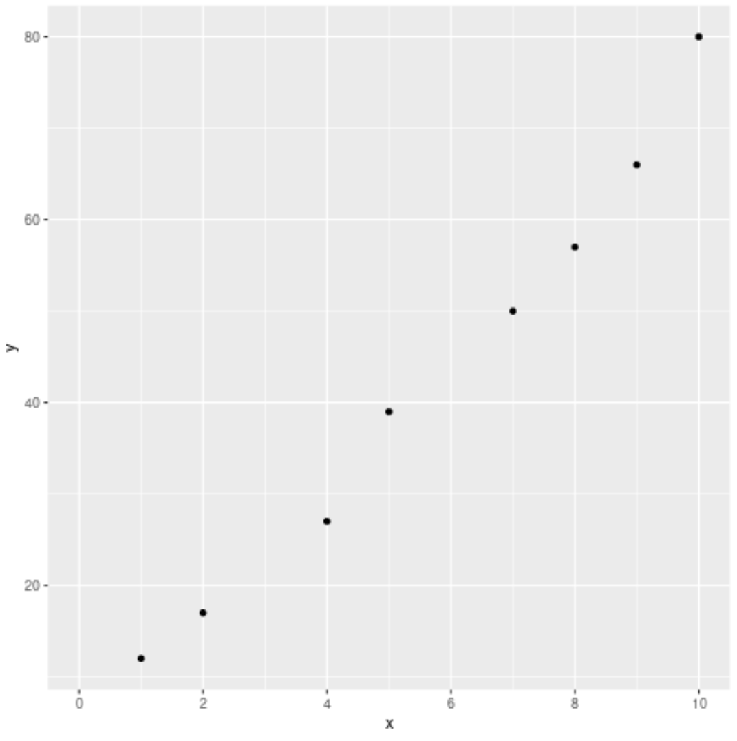
By default, the y-axis shows breaks at 20, 40, 60, and 80. However, we can use the scale_y_continuous() function to display breaks at every 10 values instead:
#create scatterplot of x vs. y with custom breaks on y-axis
ggplot(df, aes(x=x, y=y)) +
  geom_point() +
scale_y_continuous(limits = c(0, 100), breaks = seq(0, 100, 10)) 
Example 2: Set X-Axis Breaks
We can use the scale_x_continuous() function to set the breaks on the x-axis:
#create scatterplot of x vs. y with custom breaks on x-axis
ggplot(df, aes(x=x, y=y)) +
  geom_point() +
scale_x_continuous(limits = c(0, 10), breaks = c(0, 2, 4, 6, 8, 10)) 
We typically set axis breaks at uniform intervals, but we could choose to set axis breaks only at specific numbers.
For example, the following code shows how to display x-axis breaks only at the values 0, 7, and 10:
#create scatterplot of x vs. y with custom breaks on x-axis
ggplot(df, aes(x=x, y=y)) +
  geom_point() +
scale_x_continuous(limits = c(0, 10), breaks = c(0, 7, 10)) 
Additional Resources
The following tutorials show how to perform other common operations in ggplot2:
How to Create a Log Scale in ggplot2
How to Set Axis Limits in ggplot2
How to Rotate Axis Labels in ggplot2
