If the relationship between two variables is quadratic, then you can use a quadratic trendline to capture their relationship in a plot.

This tutorial provides a step-by-step example of how to add a quadratic trendline to a scatterplot in Excel.
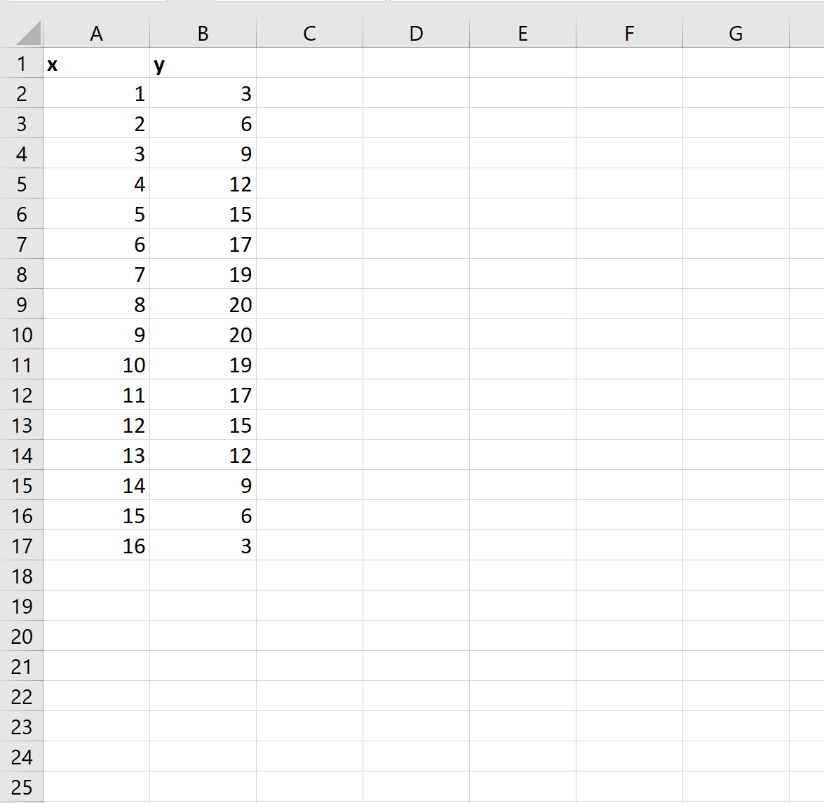
Step 1: Create the Data
First, let’s create some data to work with:
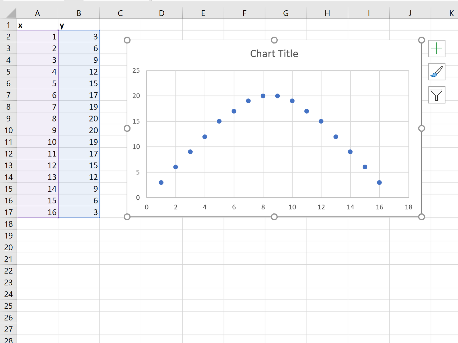
Step 2: Create a Scatterplot
Next, highlight cells A2:B17. Click the Insert tab along the top ribbon, then click the first chart option under Insert Scatter in the Charts group.
The following scatterplot will automatically be displayed:
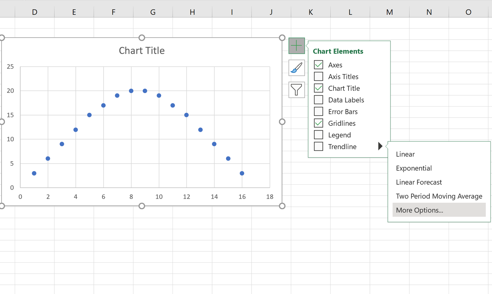
Step 3: Add the Quadratic Trendline
Next, click the green plus “+” sign in the top right corner of the plot. Click the arrow to the right of Trendline, then click More Options.
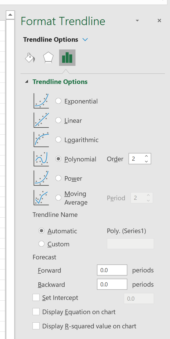
In the window that appears to the right, click Polynomial and select 2 for Order:
The following quadratic trendline will automatically be displayed on the chart:
Feel free to click on the trendline itself to change the style or color.
Additional Resources
How to Perform Quadratic Regression in Excel
Curve Fitting in Excel (With Examples)