Angular Material (MAT) Form-Field
Introduction
The <mat-form-field> is a component that is used to wrap multiple MAT components and implement common text field styles of the form-field such as hint message, underlines, and floating label.
These five MAT components are designed to work inside the form-field:
- <mat-chip-list>
- <input matNativeControl>
- <textarea matNativeControl>
- <mat-select>
- <select matNativeControl>
API reference for Angular Material form-field
Example 1: Simple Form

Form field appearance variants
The <mat-form-field> supports four different appearance forms that can be set through appearance input.
| S. No | Appearance variant names | Description |
|---|---|---|
| 1. | Legacy appearance | It is the default style of the mat-form-field that is used to display the input-box with an underline. |
| 2. | Standard appearance | It is a new version of the legacy appearance. It is more consistent with the fill and outline appearances. |
| 3. | Fill appearance | In addition to the underline, it shows the <mat-form-field> with a filled background box. |
| 4. | Outline appearance | It shows the <mat-form–field> with a border all the way around, not just an underline. |
Example 2: Form-field appearance variants

Hint labels
Hint labels are additional descriptive-text that appears below the underline of the <mat-form-field>. It contains two hint labels: first start-aligned and the other end-aligned.
Hint labels are specified in two ways.
- By using the hintLabel property of the <mat-form-field>.
- By adding the <mat-hint> module in the form field.
When multiple hints are added to the same page, the probability of error on that page increases.
Example 3: Form field with hints

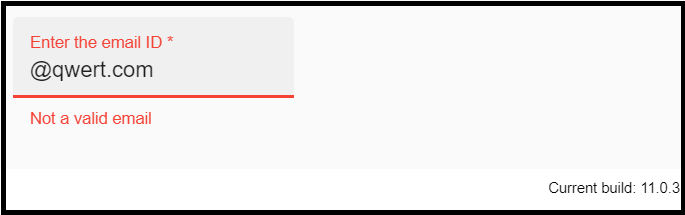
Error messages
The error message can be shown under the form field by adding the <mat-error> module. The errors are initially hidden that is displayed on the invalid entry after the user interacts with the element, or the original form is submitted.
If the form field can contain more than one error condition, it is up to the consumer to display which messages first. It can be done with ngSwitch, ngIf, or CSS. If required, multiple error messages may be displayed at the same time, but <mat-form-field> only has enough space to display one error message at a time.
Example 4: Error message form
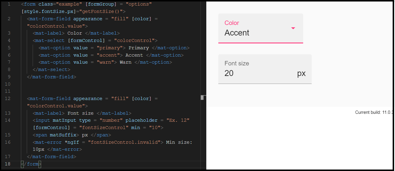
Theming and Font-Size
The <mat-form-field> has a color-palette that can be set the color of the form fields. It sets the color of the form field based on your application’s theme colors.
The <mat-form-field> derives its font-size from its parent element. It can be overridden in a clear shape using CSS.
Example 5: Form field theming and font-size
HTML Code
CSS Code:
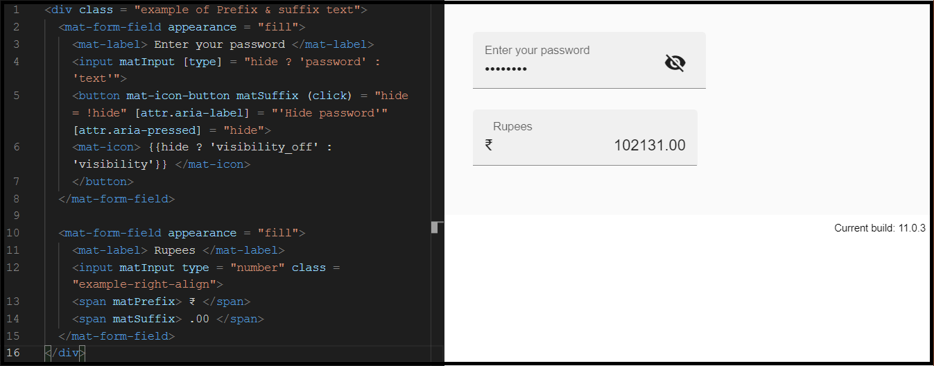
Prefix & suffix
The input of the text field can be included before and after the input tag, as a suffix or prefix. The text field view will be included within the container that wraps the form control according to the content specification.
If you want to add a text-prefix element to the text field, you must use the matPrefix directive inside the <mat-form-field>. Similarly, if you want to add a text-suffix element to the text field, you must use the matSuffix directive inside the <mat-form-field>.
Example 6: Prefix & Suffix form field