A box plot is a type of plot that displays the five number summary of a dataset, which includes:
- The minimum value
- The first quartile (the 25th percentile)
- The median value
- The third quartile (the 75th percentile)
- The maximum value
We use the following process to draw a box plot:
- Draw a box from the first quartile (Q1) to the third quartile (Q3)
- Then draw a line inside the box at the median
- Then draw “whiskers” from the quartiles to the minimum and maximum values

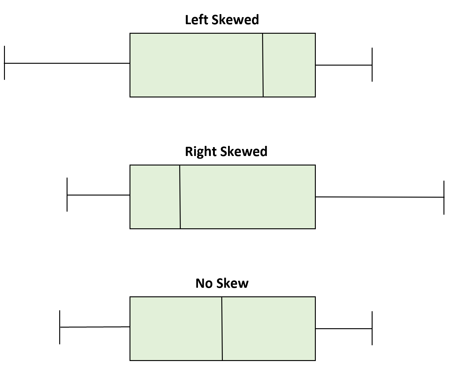
We can determine whether or not a distribution is skewed based on the location of the median value in the box plot.

When the median is closer to the bottom of the box and the whisker is shorter on the lower end of the box, the distribution is right-skewed (or “positively” skewed).
When the median is closer to the top of the box and the whisker is shorter on the upper end of the box, the distribution is left-skewed (or “negatively” skewed).
When the median is in the middle of the box and the whiskers are roughly equal on each side, the distribution is symmetrical (or “no” skew).
The following examples illustrate how to use box plots to determine if a distribution is right-skewed, left-skewed, or has no skew.
Example 1: Right-Skewed Distribution
The distribution of annual household incomes in the United States is right-skewed. Most households earn between $40k and $80k per year but there’s a long right tail on the distribution that represents households that earn much more.
If we created a box plot to visualize the distribution of household incomes, it would look something like this:

Notice that the vertical line inside the box that represents the median is much closer to the first quartile than the third quartile, which means the distribution is right-skewed.

Example 2: Left-Skewed Distribution
The distribution of the age of deaths in most populations is left-skewed. Most people live to be between 70 and 80 years old, with fewer and fewer living less than this age.
If we created a box plot to visualize the distribution of the age of deaths, it would look something like this:

Notice that the vertical line inside the box that represents the median is much closer to the third quartile than the first quartile, which means the distribution is left-skewed.

Example 3: Symmetrical Distribution
The distribution of the height of males is roughly symmetrically distributed and has no skew. For example, the average height of a male in the United States is roughly 69.1 inches. The distribution of heights is roughly symmetrical, with some being shorter and some being taller.
If we created a box plot to visualize the distribution of the height of males in the United States, it would look something like this:

Notice that the vertical line inside the box that represents the median is equally close to the first quartile and the third quartile, which means the distribution is symmetrical and has no skew.

Additional Resources
Left Skewed vs. Right Skewed Distributions
How to Compare Box Plots (With Examples)
How to Create Side-by-Side Boxplots in Excel
