A histogram is a plot that can be used to quickly visualize the distribution of values in a dataset.
This tutorial provides a step-by-step example of how to overlay two histograms in a single plot in Excel.
Step 1: Enter the Data
First, let’s enter the following data that shows the gender and exam scores for 20 students in a class:

Step 2: Create Pivot Table
Next, highlight the cells in the range A1:C21, then click the Insert tab along the top ribbon, then click the icon called PivotTable:

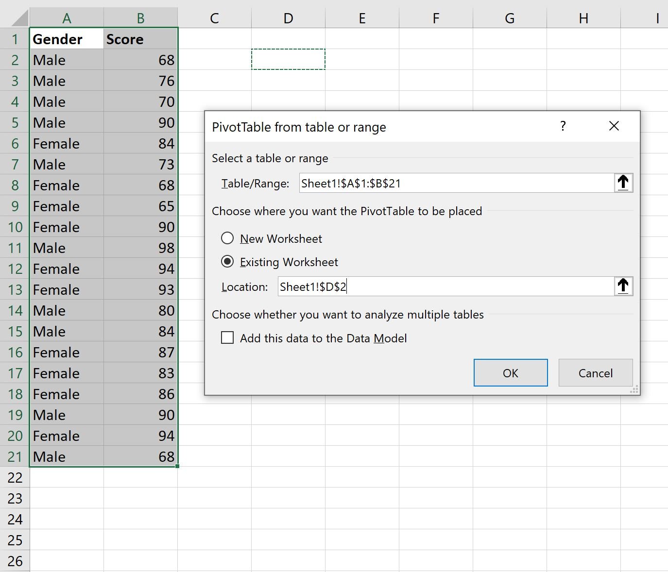
In the window that appears, type the following information and then click OK:
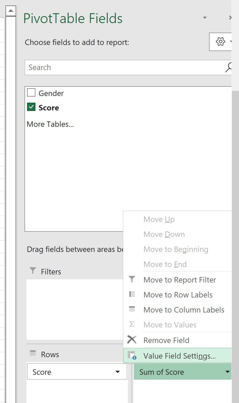
In the PivotTable Fields panel that appears on the right side of the screen, drag the Score variable to both the Rows and Values boxes:

Next, click the Sum of Score dropdown arrow and then click Value Field Settings:
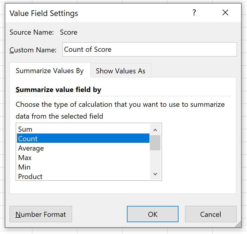
In the new window that appears, click Count and then click OK:
Next, click any value in the pivot table, then click the PivotTable Analyze tab, then click Group Selection:

In the new window that appears, group the data Starting at 65, Ending at 100, By 5, then click OK:

Lastly, drag the Gender variable to the Columns box:
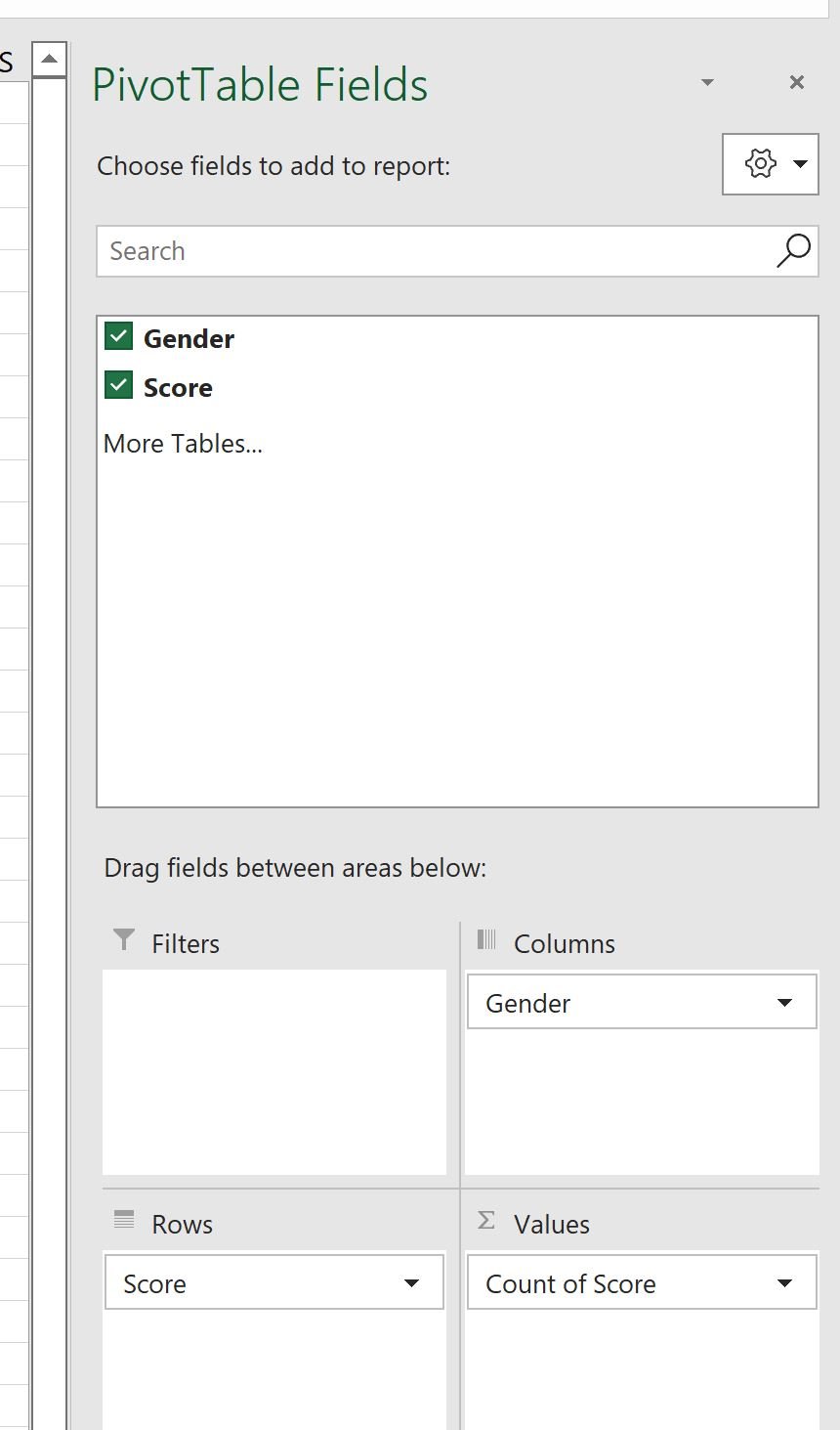
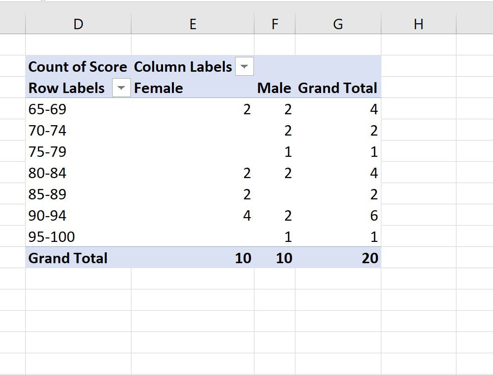
Here’s what the updated pivot table looks like:
Step 3: Overlay Two Histograms in Plot
Next, click the PivotTable Analyze tab, then click the icon called PivotChart:

In the new window that appears, choose Clustered Column as the chart type and then click OK:

The following chart will appear:
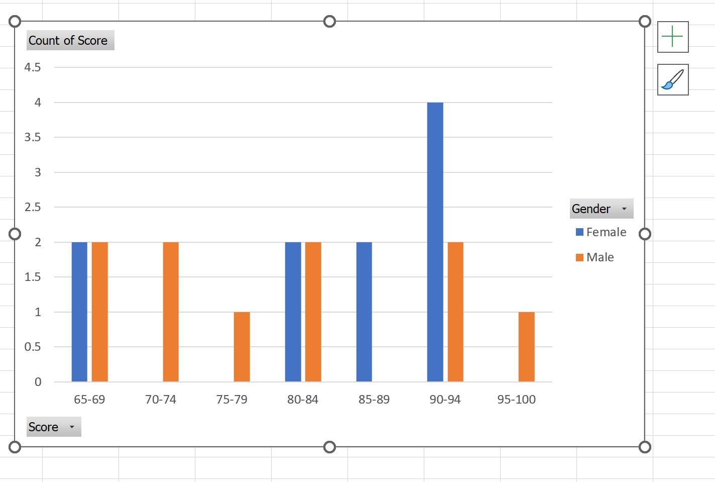
The blue bars display the frequency of exam scores for the Females and the orange bars display the frequencies for the Males.
For example, we can see:
- Two females and two males scored between 65-69.
- Zero females and two males scored between 70-74.
- Zero females and one male scored between 75-79.
And so on.
Additional Resources
The following tutorials explain how to perform other common tasks in Excel:
How to Change Bin Width of Histograms in Excel
How to Perform Data Binning in Excel
How to Perform Exploratory Data Analysis in Excel
