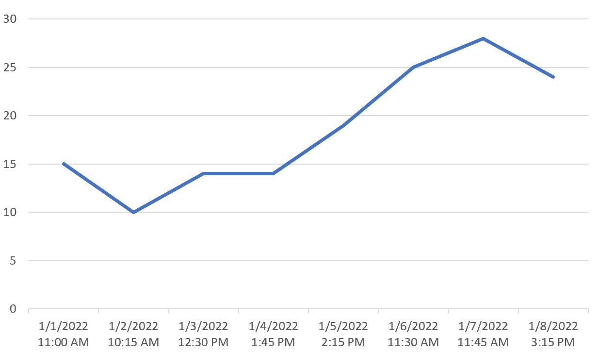
Often you may want to plot time values over multiple days in Excel, similar to the chart below:
The following step-by-step example shows exactly how to do so.
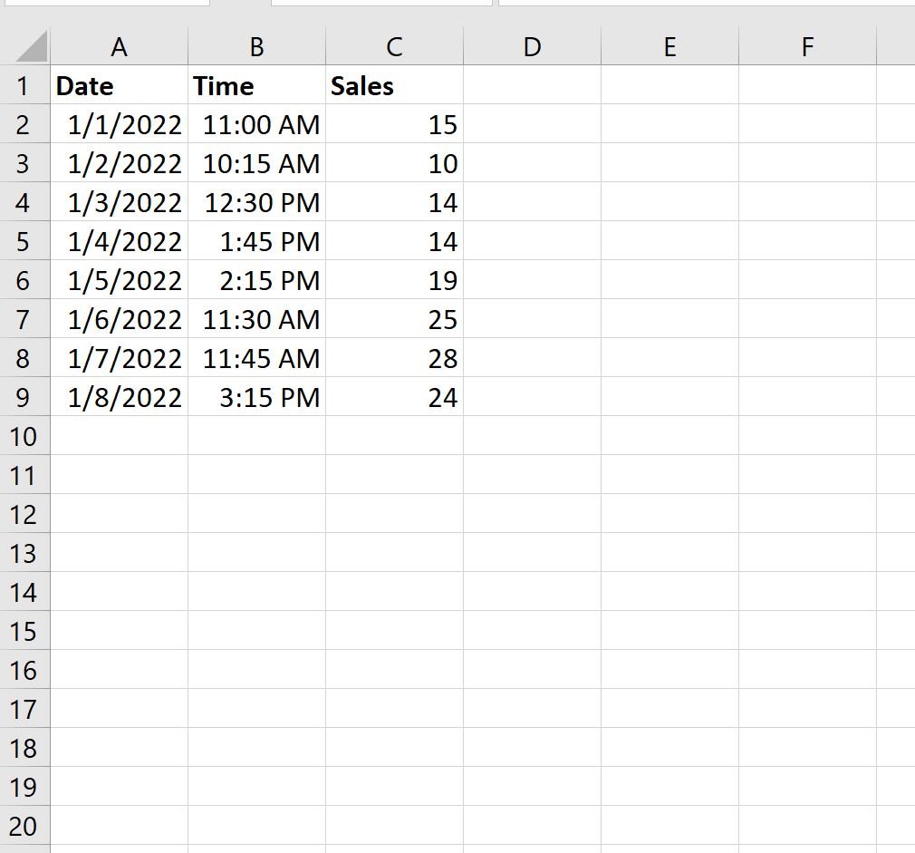
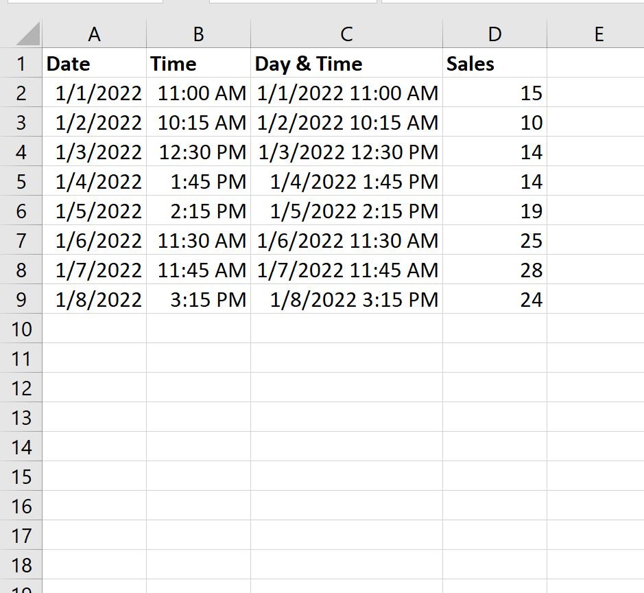
Step 1: Enter the Data
First, let’s enter the following data into Excel that shows the number of sales during various days and times at some store:
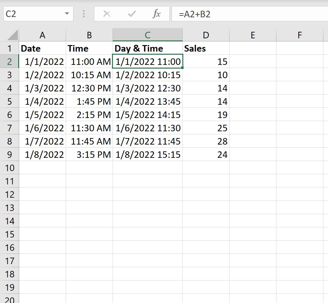
Step 2: Create a Day & Time Column
Next, type the following formula into cell C2 to create a new value that displays the day and time for the first row:
=A2+B2
Then click and drag this formula down to every remaining cell in column C:
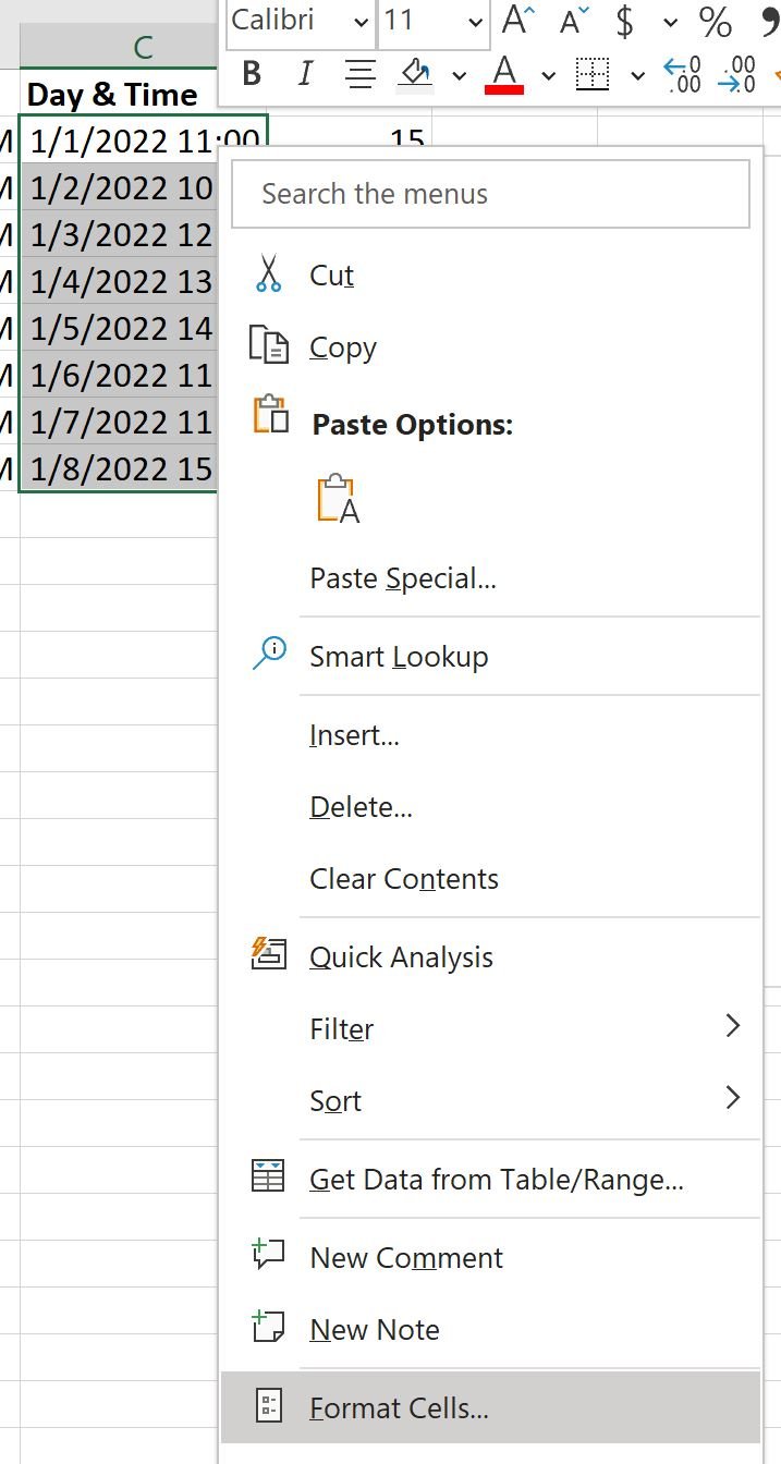
Next, highlight the cell range C2:C9 and right click. In the dropdown menu that appears, click Format Cells:
In the new window that appears, type the following formula into the Type box:
m/d/yyyy h:mm AM/PM
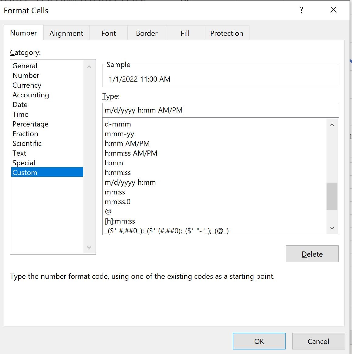
Once you click OK, the cells will automatically be formatted to show the day and time with AM or PM appended to the end:
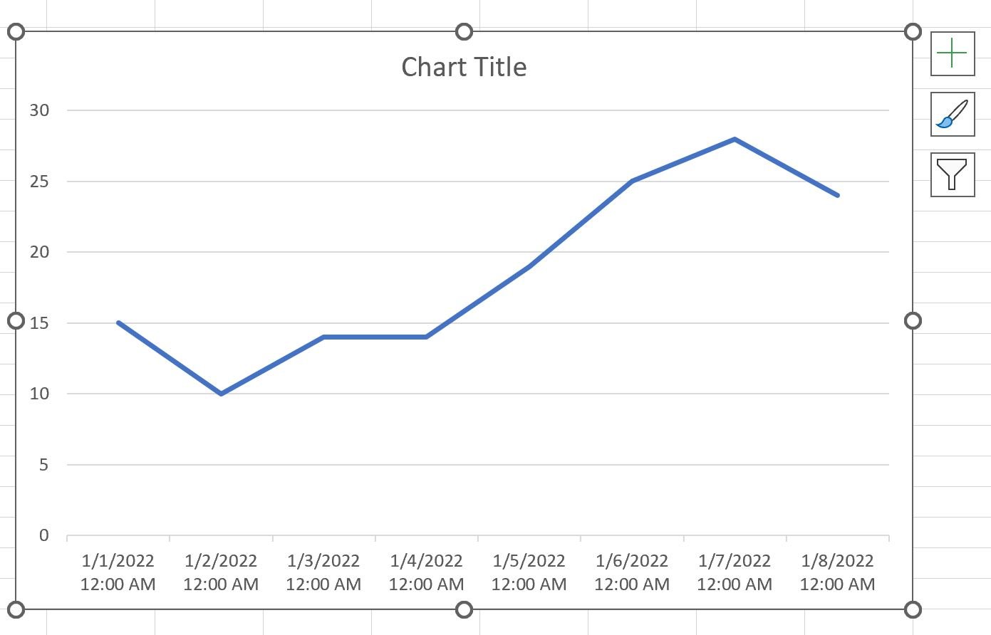
Step 3: Create a Line Chart
Next, highlight the cell range C2:D9, then click the Insert tab, then click the Line chart icon within the Charts group.
The following line chart will appear that displays the sales values by day and time:
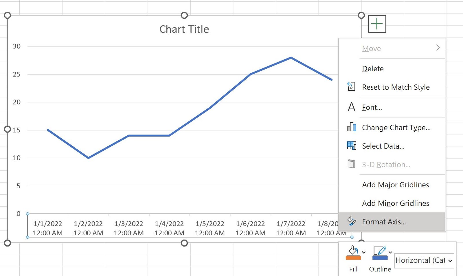
Step 4: Customize the X-Axis of the Chart
Next, right click on any value on the x-axis and then click Format Axis:
In the new panel that appears, click the button under Axis Options called Text:

The x-axis values will automatically be updated to show the exact date and time:
Additional Resources
The following tutorials explain how to perform other common tasks in Excel:
How to Plot Multiple Lines in Excel
How to Create a Clustered Stacked Bar Chart in Excel
How to Create a Scatterplot with Multiple Series in Excel