One of the first steps of any data analysis project is exploratory data analysis.
This involves exploring a dataset in three ways:
1. Summarizing a dataset using descriptive statistics.
2. Visualizing a dataset using charts.
3. Identifying missing values.
By performing these three actions, you can gain an understanding of how the values in a dataset are distributed and detect any problematic values before proceeding to perform a hypothesis test, fit a regression model, or perform statistical modeling.
The following step-by-step example shows how to perform exploratory data analysis in Excel.
Step 1: Create the Dataset
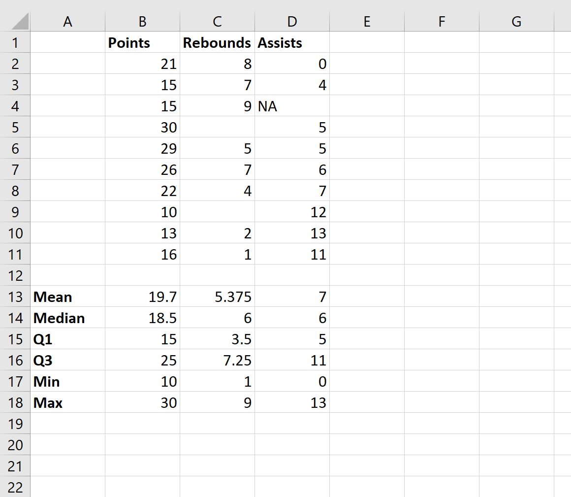
First, let’s create a simple dataset that contains information about 10 different basketball players:

This dataset contains three variables (Points, Rebounds, Assists) and some of the variables have blank or NA values, which is common in real-world datasets.
Step 2: Summarize the Data
Next, we can calculate the mean, median, quartiles, minimum, and maximum values for each of the three variables in this dataset:

Here is the formula we used for each cell in column B:
- B13: =AVERAGE(B2:B11)
- B14: =MEDIAN(B2:B11)
- B15: =QUARTILE(B2:B11, 1)
- B16: =QUARTILE(B2:B11, 3)
- B17: =MIN(B2:B11)
- B18: =MAX(B2:B11)
We then dragged each formula to the right so that we could calculate the same metrics for the values in columns C and D.
By calculating these descriptive statistics for each variable, we can gain a good understanding of the distribution of values for each variable.
Note: Each formula automatically ignores blank or NA values when calculating each descriptive statistic.
Step 3: Visualize the Data
We can also create charts to visualize the values in the dataset.
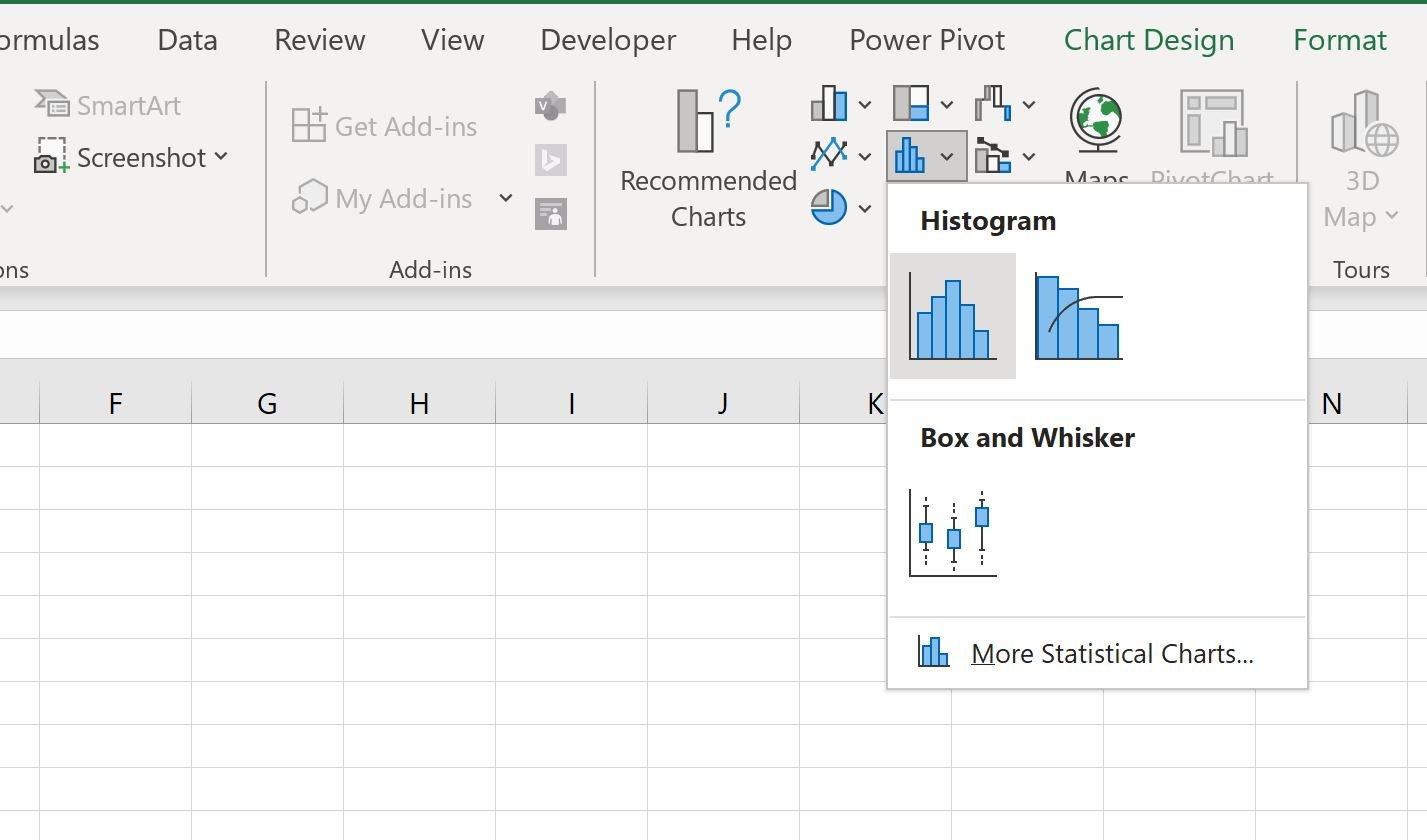
For example, to visualize the distribution of values for the Points variable, we can highlight the values in the cell range B2:B11, then click the Insert tab along the top ribbon, then click the Histogram icon within the Charts group:

The following histogram will automatically be created:

This histogram allows us to visualize the distribution of points scored by the players.
For example, we can see:
- 4 players scored between 10 and 15 points.
- 1 player scored between 15 and 20 points.
- 2 players scored between 20 and 25 points.
- 3 players scored between 25 and 30 points.
We can repeat this process for each variable in our dataset to visualize the distribution of values for each variable.
Step 4: Identify Missing Values
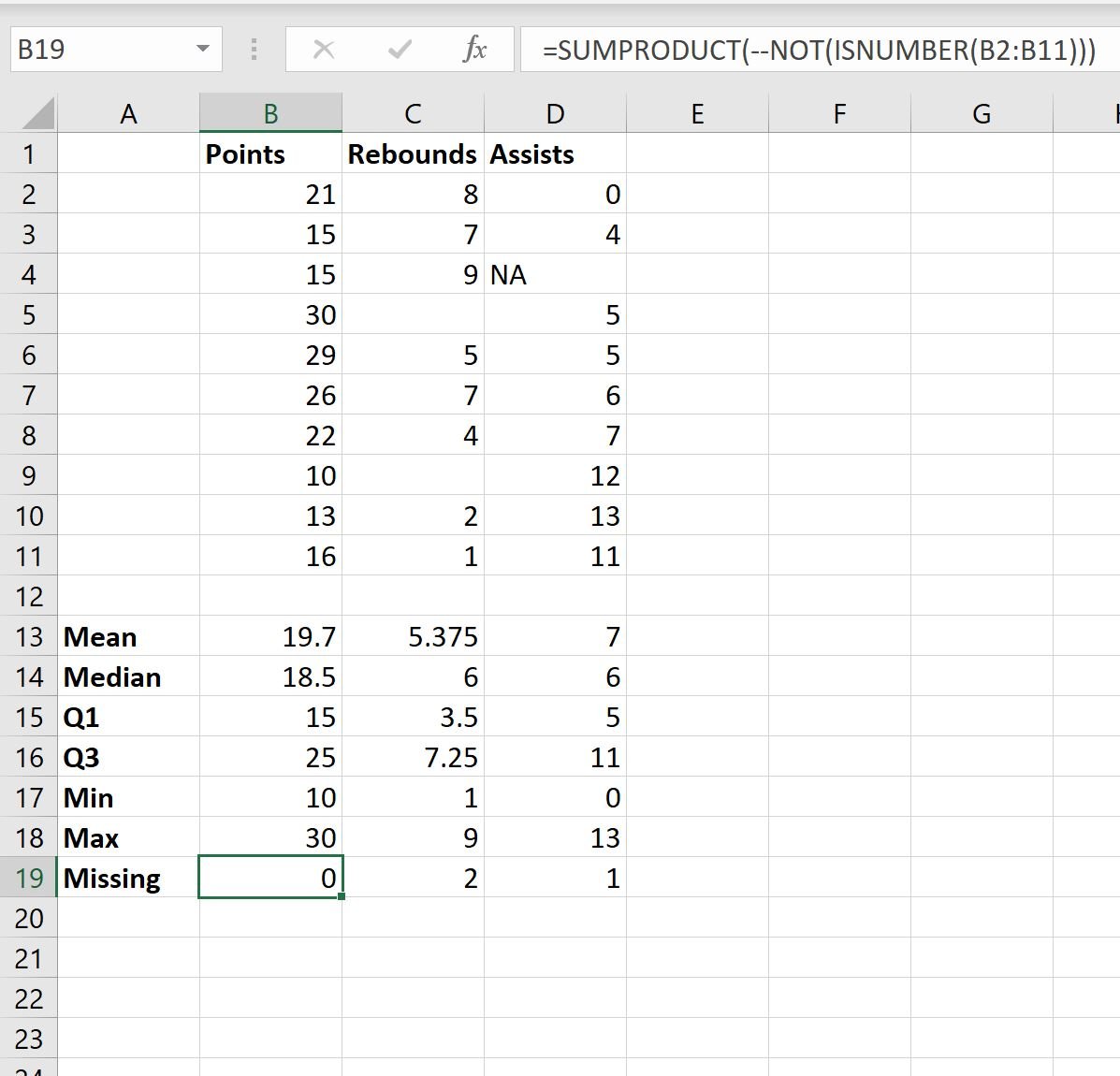
We can also use the following formula to count the number of missing values in column B:
=SUMPRODUCT(--NOT(ISNUMBER(B2:B11))) We can type this formula into cell B19 and then drag it to the right to calculate the number of missing values for each variable in the dataset:

From the output we can see:
- There are 0 missing values in the Points column.
- There are 2 missing values in the Rebounds column.
- There is 1 missing value in the Assists column.
We have now completed a basic exploratory data analysis on this dataset and have gained a pretty good understanding of how the values are distributed for each variable in this dataset.
Related: How to Replace Blank Cells with Zero in Excel
Additional Resources
The following tutorials explain how to perform other common tasks in Excel:
How to Calculate a Five Number Summary in Excel
How to Calculate the Average by Group in Excel
How to Calculate Max Value by Group in Excel
