You can use the following basic syntax to connect points with lines in a plot in ggplot2:
library(ggplot2)

ggplot(df, aes(x=x_var, y=y_var)) +
  geom_line() +
  geom_point()
The following example shows how to use this syntax in practice.
Example: Connect Points with Lines in ggplot2
Suppose we have the following data frame that contains the number of sales made at some store during 10 consecutive days:
#create data frame
df frame(day=1:10,
                 sales=c(3, 5, 5, 8, 12, 10, 8, 8, 5, 9))

#view data frame
df

   day sales
1    1     3
2    2     5
3    3     5
4    4     8
5    5    12
6    6    10
7    7     8
8    8     8
9    9     5
10  10     9
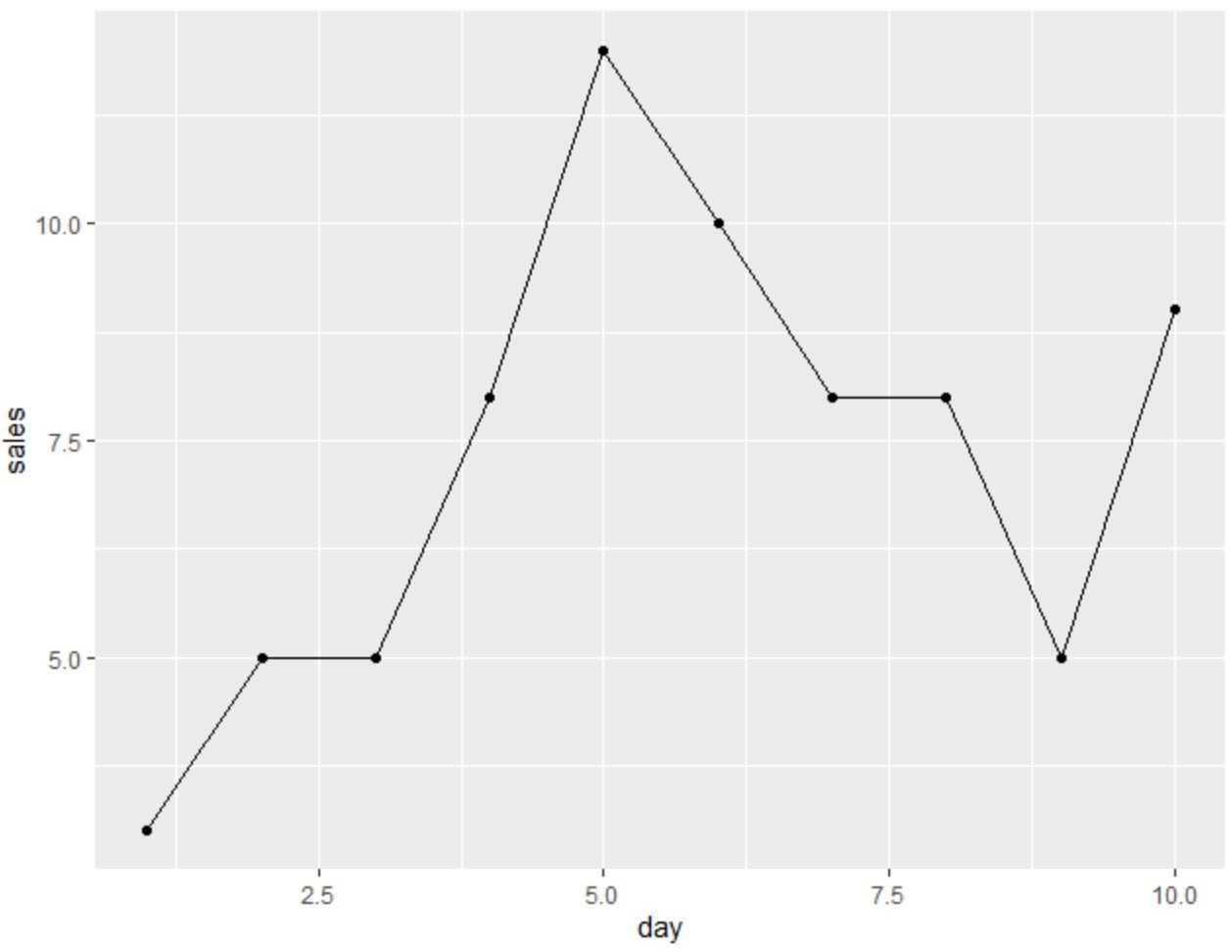
We can use the following code to create a plot in ggplot2 that has connected points to represent the sales made each day:
library(ggplot2)

#create plot with connected points
ggplot(df, aes(x=day, y=sales)) +
  geom_line() +
  geom_point()

The x-axis displays the day and the y-axis displays the sales.
Also note that you can use the color, size, linetype, shape, and fill arguments to modify the appearance of both the line and the points in the plot:
library(ggplot2)

#create plot with connected points
ggplot(df, aes(x=day, y=sales)) +
  geom_line(color='grey', size=1.5, linetype='dashed') +
  geom_point(shape=21, color='black', fill='pink', size=6)

Feel free to change the values for any of these arguments to make the plot appear exactly how you would like.
Additional Resources
The following tutorials explain how to perform other common tasks in ggplot2:
How to Plot Multiple Lines in ggplot2
How to Add an Average Line to Plot in ggplot2
How to Change Line Colors in ggplot2
