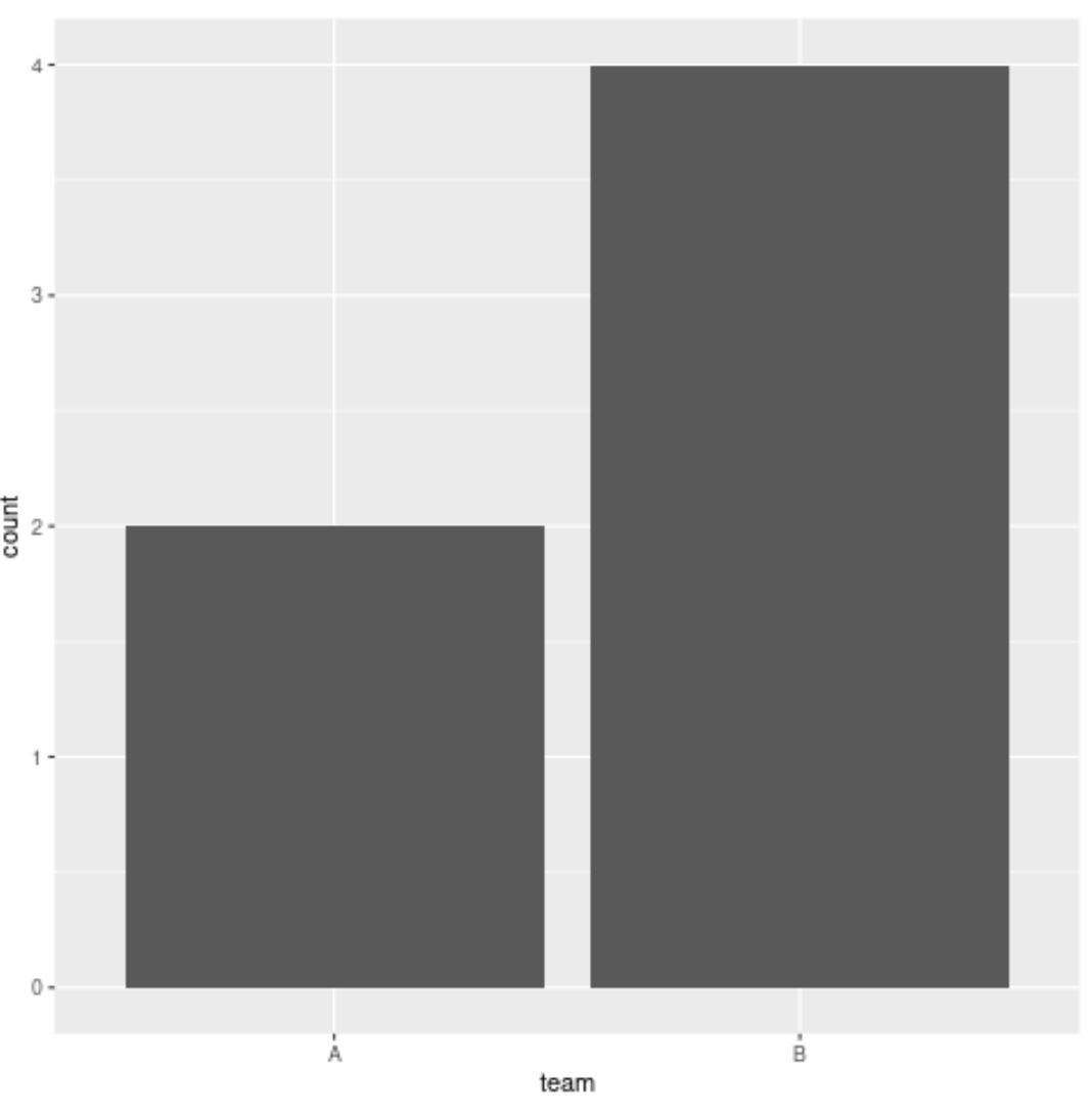
You can use the following basic syntax to remove NA values from a plot in ggplot2:
library(ggplot2)

ggplot(data=subset(df, !is.na(this_column)), aes(x=this_column)) +
  geom_bar()
This particular example creates a bar plot and removes any rows in the data frame where an NA value occurs in the column called this_column.
The following example shows how to use this syntax in practice.
Example: Remove NAs from Plot in ggplot2
Suppose we have the following data frame that contains information on the number of points scored by basketball players on various teams:
#create data frame df frame(team=c('A', 'A', NA, NA, 'B', 'B', 'B', 'B'), points=c(22, 29, 14, 8, 5, 12, 26, 36)) #view data frame df team points 1 A 22 2 A 29 314 4 8 5 B 5 6 B 12 7 B 26 8 B 36
Now suppose we attempt to create a bar plot in ggplot2 to visualize the number of occurrences of each team:
library(ggplot2)

#create bar plot to visualize occurrences by team
ggplot(df, aes(x=team)) +
  geom_bar()

Notice that the plot automatically creates a bar to display the occurrences of NA values in the team column.
To remove this bar from the plot, we can use the subset() function to subset the data frame to only include rows where the value in the team column is not NA:
library(ggplot2)

#create bar plot to visualize occurrences by team and remove NA
ggplot(data=subset(df, !is.na(team)), aes(x=team)) +
  geom_bar()

This bar plot still displays the number of occurrences for the values ‘A’ and ‘B’ in the team column but it no longer includes a bar to display the number of occurrences for NA values.
Additional Resources
The following tutorials explain how to perform other common tasks in ggplot2:
How to Remove Axis Labels in ggplot2
How to Remove a Legend in ggplot2
How to Remove Gridlines in ggplot2
