A barplot is useful for visualizing the quantities of different categorical variables.
Sometimes we want to create a barplot that visualizes the quantities of categorical variables that are split into subgroups.
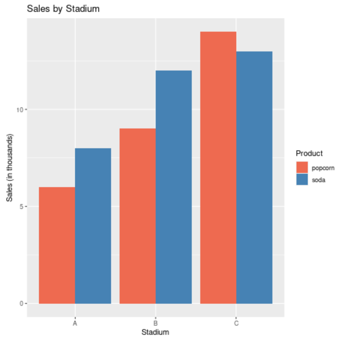
For example, we may want to visualize the total popcorn and soda sales for three different sports stadiums. This tutorial provides a step-by-step example of how to create the following barplot with multiple variables:
Step 1: Create the Data
First, let’s create a data frame to hold our data:
#create data
df rep(c('A', 'B', 'C'), each=4),
                 food=rep(c('popcorn', 'soda'), times=6),
                 sales=c(4, 5, 6, 8, 9, 12, 7, 9, 9, 11, 14, 13))

#view data
df

   stadium    food sales
1        A popcorn     4
2        A    soda     5
3        A popcorn     6
4        A    soda     8
5        B popcorn     9
6        B    soda    12
7        B popcorn     7
8        B    soda     9
9        C popcorn     9
10       C    soda    11
11       C popcorn    14
12       C    soda    13
Step 2: Create the Barplot with Multiple Variables
The following code shows how to create the barplot with multiple variables using the geom_bar() function to create the bars and the ‘dodge’ argument to specify that the bars within each group should “dodge” each other and be displayed side by side.
ggplot(df, aes(fill=food, y=sales, x=stadium)) +
  geom_bar(position='dodge', stat='identity')
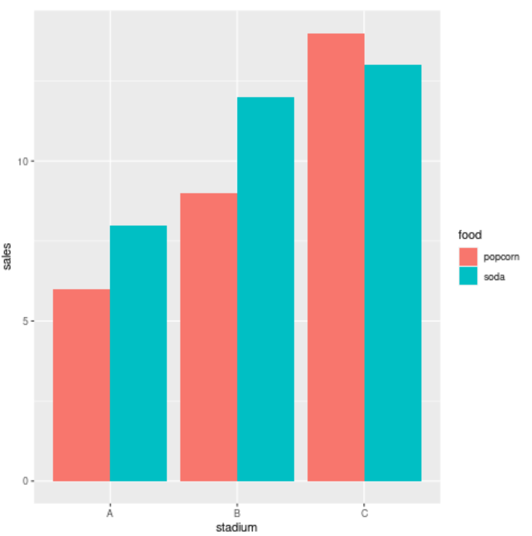
The various stadiums – A, B, and C – are displayed along the x-axis and the corresponding popcorn and soda sales (in thousands) are displayed along the y-axis.
Step 3: Modify the Aesthetics of the Barplot
The following code shows how to add a title, modify the axes labels, and customize the colors on the barplot:
ggplot(df, aes(fill=food, y=sales, x=stadium)) +
  geom_bar(position='dodge', stat='identity') +
  ggtitle('Sales by Stadium') +
  xlab('Stadium') +
  ylab('Sales (in thousands)') +
  scale_fill_manual('Product', values=c('coral2','steelblue'))
Additional Resources
How to Change the Legend Title in ggplot2
How to Change Legend Size in ggplot2
A Complete Guide to the Best ggplot2 Themes