A survival curve is a chart that shows the proportion of a population that is still alive after a given age, or at a given time after contracting some type of disease.
This tutorial shows how to create a survival curve in Excel.
Creating a Survival Curve in Excel
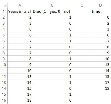
Suppose we have the following dataset that shows how long a patient was in a medical trial (column A) and whether or not the patient was still alive at the end of the trial (column B).

In order to create a survival curve for this data, we need to first get the data in the correct format, then use the built-in Excel charts to create the curve.
Formatting the Data
Use the following steps to get the data in the correct format.
Step 1: List all of the unique “Years in trial” values in column A in column D:
Note: Always include “0” as the first value.

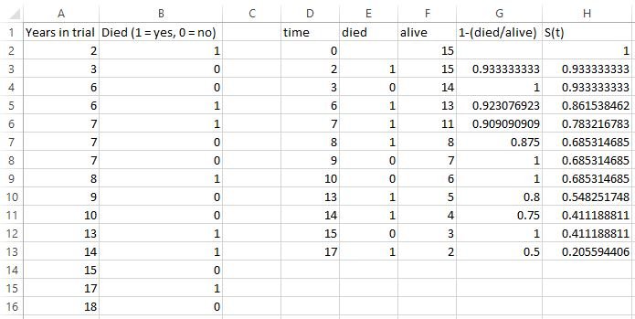
Step 2: Create the values in columns E through H using the formulas shown below.
Note: we removed the value “18” in column D since there were no death values associated with that time.

Here are the formulas used in the following cells:
E3: =COUNTIFS($A$2:$A$16,D3,$B$2:$B$16,1)
F2: =COUNTIF($A$2:$A$16, “>”&D2-1)
G3: =1-(E3/F3)
H2: =1
H3: =H2*G3
In order to fill in all of the other values in column E, simply highlight the range E4:E13 and press Ctrl-D. Fill in all of the other values in columns F through H using the same trick.
Now we’re ready to create the survival curve.
Creating the Survival Curve
Use the following steps to create the survival curve.
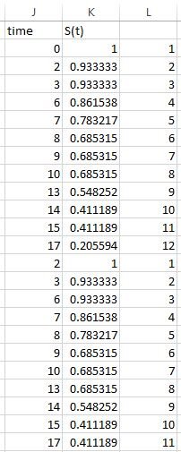
Step 1: Copy the values in columns D and H into the columns J and K.

Step 2: Copy the values in the range J3:J13 to J14:J24. Then copy the values in the range K2:K12 to K14:K24.

Step 3: Create a list of values in column L as shown below, then sort from smallest to largest values in column L:


Step 4: Highlight cells J2:K24, then select “Insert” > “Charts|Scatter” > “Scatter with Straight Lines and Markers” option.
Feel free to modify the title, axes names, and chart colors. The resulting chart will look something like this:

