A semi-log graph is a type of graph that uses a linear scale on the x-axis and a logarithmic scale on the y-axis.
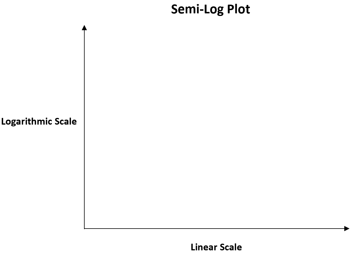
We often use this type of graph when the values for the y variable have much greater variability compared to the values for the x variable.
This type of graph is particularly useful for visualizing percentage change of some variable over time.
The following examples show how to read semi-log graphs in practice.
Example 1: Semi-Log Graph for Plant Growth
Suppose a biologist wants to create a line chart to visualize the growth of a certain plant during a 20-week period.
She first creates the following line chart using a linear scale on the y-axis:
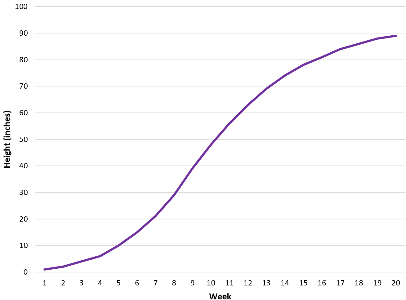
This chart is useful for visualizing the raw change in plant height from one week to the next.
However, she can use a semi-log graph to more easily visualize the percentage change in plant height from one week to the next:
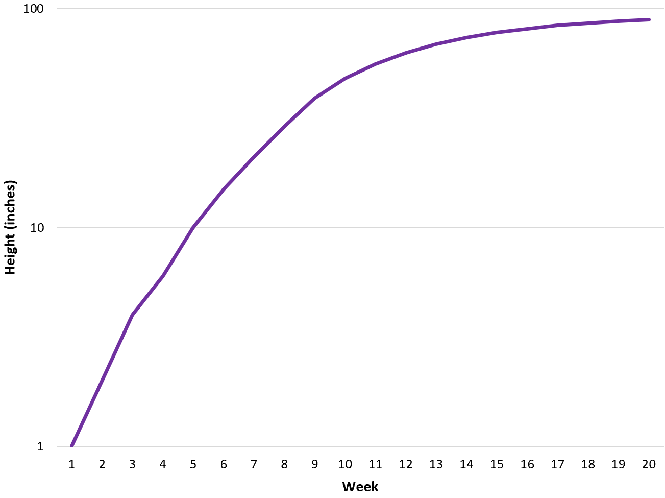
Notice that the y-axis is measured on a logarithmic scale.
Using this graph, we can see that the percentage growth of the plant is quickest in the early weeks and then slows down dramatically in the later weeks.
Example 2: Semi-Log Graph for Investment Growth
Suppose an investor wants to create a line chart to visualize the growth of a certain investment during a 30-year period.
He first creates the following line chart using a linear scale on the y-axis:
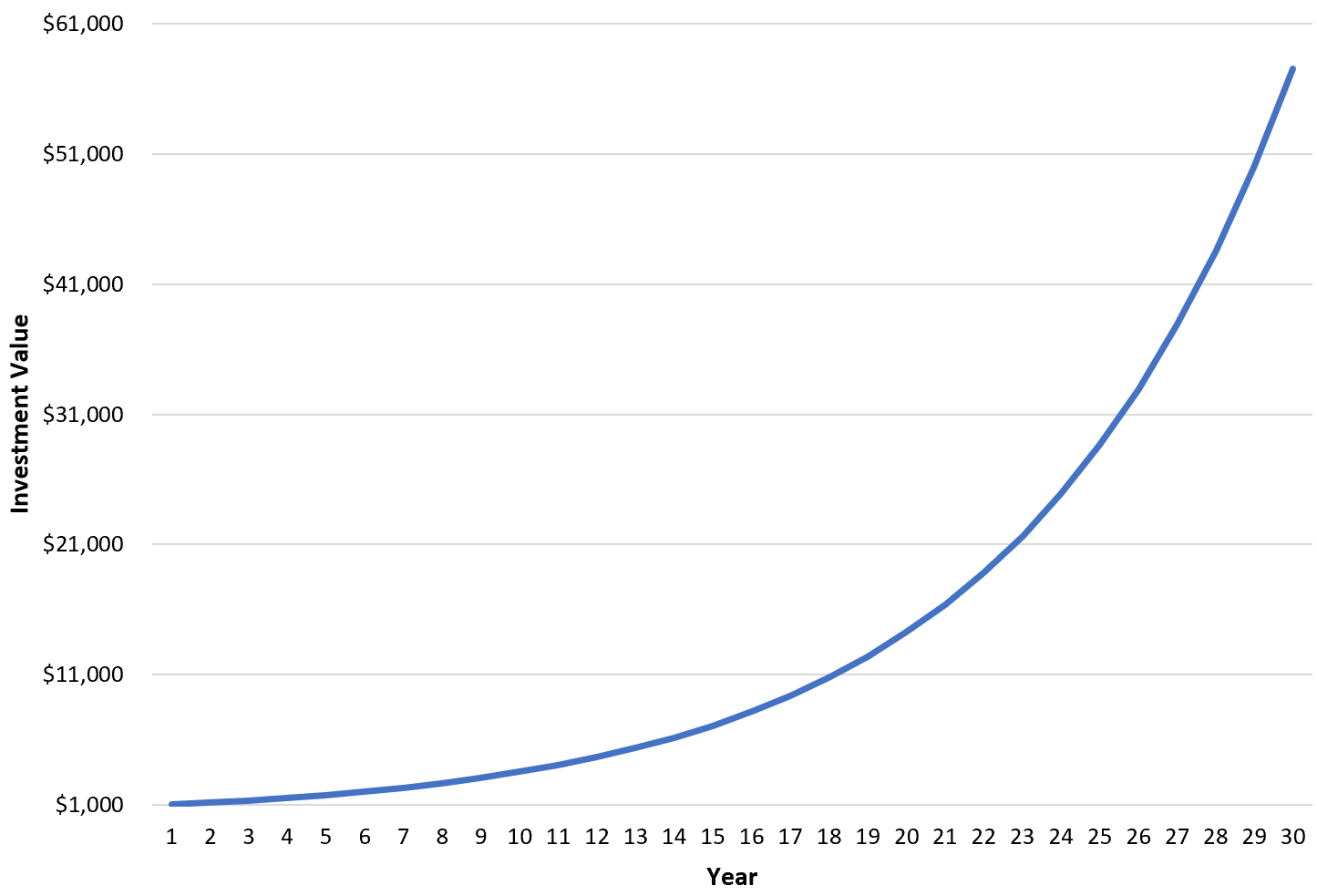
This chart is useful for visualizing the raw change in the investment value from one year to the next.
However, he can use a semi-log graph to more easily visualize the percentage change in the investment value from one year to the next:
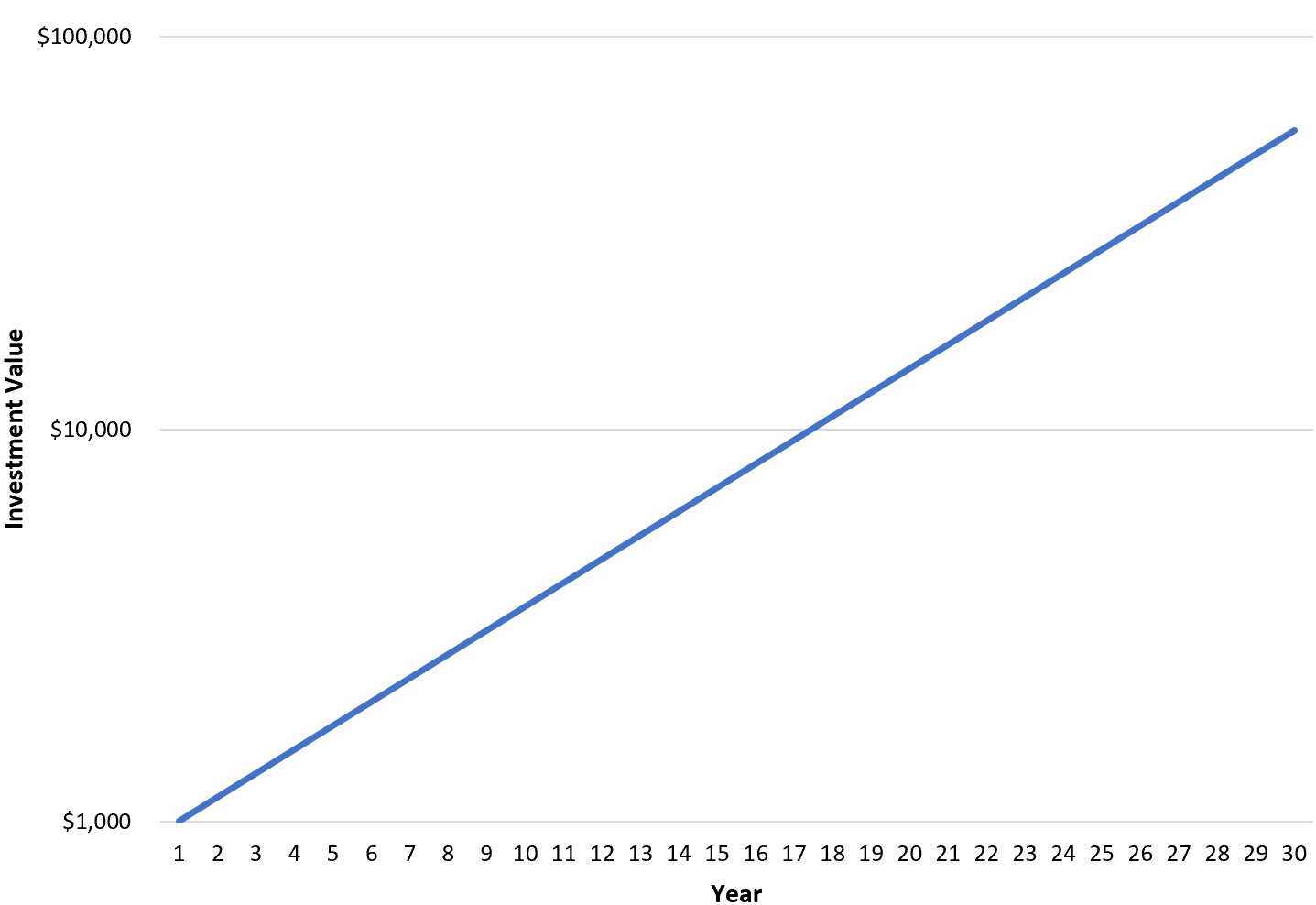
Notice that the y-axis is measured on a logarithmic scale.
Using this graph, we can see that the percentage growth of the investment is actually consistent from one year to the next.
Additional Resources
The following tutorials offer additional information on using log scales in plots:
How to Create a Semi-Log Graph in Excel
When Should You Use a Log Scale in Charts?