Ionic Grid
The Ionic grid system is a powerful mobile-based flexbox system for building a custom layout. A flexbox is a CSS feature which is supported by all devices that Ionic supports. The Ionic grid is mainly composed of three units which are a grid, rows, and columns. It allows you to choose as many rows and columns you want. They can automatically adjust the size to accommodate the available space, although it can be changed according to your needs. The Ionic grid is made up of 12 column layout with different breakpoints based on the screen size. We can also customize the number of columns by using CSS.
Grid Column
The grid columns are a cellular component that goes inside of a row. All the content of a grid goes inside of a column.
Grid Rows
The grid rows are horizontal components that contain a varying number of columns. It ensures the columns are positioned properly.
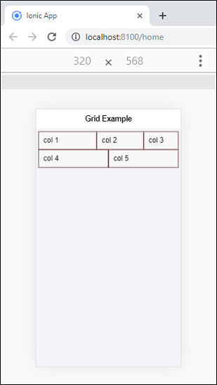
Example
Here, we are creating a simple grid which shows you the use of rows and columns.
Output
When we execute the app, it will give the following output.

Column Size
If you do not want to leave the column sizes adjusted automatically, you can choose the size attribute to set the column size according to your need. The following example helps us to understand the use of size attribute accurately.
Example
Note: This example will have borders applied to the column to display it in a way that is easy to understand.
Here, the first row uses the customized size, whereas the second row uses the default column size.
Output
Reordering Columns
You can reorder the grid columns by using the two attributes, which are as follows.
- Offset
- Push and Pull
Offset
This property is used to move the column to the right side of the specified column number. It increases the left margin of the column by the number of the specified column.
Push and pop
The push and pull properties adjust the left and right of the column by the specified number of columns.
Example
The following example clearly understands the use of offset and push and pull properties.
Output
When you execute the above Ionic app, you will get the following output. Here, the first column uses the offset property, and the second column uses the push and pull property.

Column Alignment
Ionic grid allows you to use two types of column alignments, which are as follows.
- Vertical Alignment
- Horizontal Alignment
Vertical Alignment
The grid system allows multiple ways to align content vertically. It aligned columns inside of a row by adding different classes to the row. These different classes are:
- ion-align-items-start
- ion-align-items-center
- ion-align-items-end
Example
Output
In the below output, the first row aligned columns to start, the second row aligned to center and third-row aligned to end.

Horizontal Alignment
The grid system allows multiple ways to align content horizontally. It aligned columns inside of a row by adding different classes to the row. These different classes are:
- ion-justify-content-start
- ion-justify-content-center
- ion-justify-content-end
- ion-justify-content-around
- ion-justify-content-between
Example
Output
When you run the Ionic app, it gives the following output.

Grid Size
By default, the grid takes 100 % width of the screen. If you need to set the maximum width based on the screen size, add the fixed attribute in the <ion-grid> element. The below table shows the different grid sizes.
| Name | Value | Description |
|---|---|---|
| xs | 100% | It does not set the grid width for xs screen. |
| sm | 540px | It sets the grid width to 540px when (min-width: 576px). |
| md | 720px | It sets the grid width to 720px when (min-width: 768px). |
| lg | 960px | It sets the grid width to 960px when (min-width: 992px). |
| xl | 1140px | It sets the grid width to 1140px when (min-width: 1200px). |