This tutorial provides a step-by-step example of how to label outliers in boxplots in ggplot2.
Step 1: Create the Data Frame
First, let’s create the following data frame that contains information on points scored by 60 different basketball players on three different teams:
#make this example reproducible
set.seed(1)

#create data frame
df frame(team=rep(c('A', 'B', 'C'), each=20),
                 player=rep(LETTERS[1:20], times=3),
                 points=round(rnorm(n=60, mean=30, sd=10), 2))

#view head of data frame
head(df)

  team player points
1    A      A  23.74
2    A      B  31.84
3    A      C  21.64
4    A      D  45.95
5    A      E  33.30
6    A      F  21.80
Note: We used the set.seed() function to ensure that this example is reproducible.
Step 2: Define a Function to Identify Outliers
In ggplot2, an observation is defined as an outlier if it meets one of the following two requirements:
- The observation is 1.5 times the interquartile range less than the first quartile (Q1)
- The observation is 1.5 times the interquartile range greater than the third quartile (Q3).
We can create the following function in R to label observations as outliers if they meet one of these two requirements:
find_outlier function(x) {
  return(x  quantile(x, .75) + 1.5*IQR(x))
}
Related: How to Interpret Interquartile Range
Step 3: Label Outliers in Boxplots in ggplot2
Next, we can use the following code to label outliers in boxplots in ggplot2:
library(ggplot2)
library(dplyr)

#add new column to data frame that indicates if each observation is an outlier
df %
        group_by(team) %>%
        mutate(outlier = ifelse(find_outlier(points), points, NA))

#create box plot of points by team and label outliers
ggplot(df, aes(x=team, y=points)) +
  geom_boxplot() +
geom_text(aes(label=outlier), na.rm=TRUE, hjust=-.5) 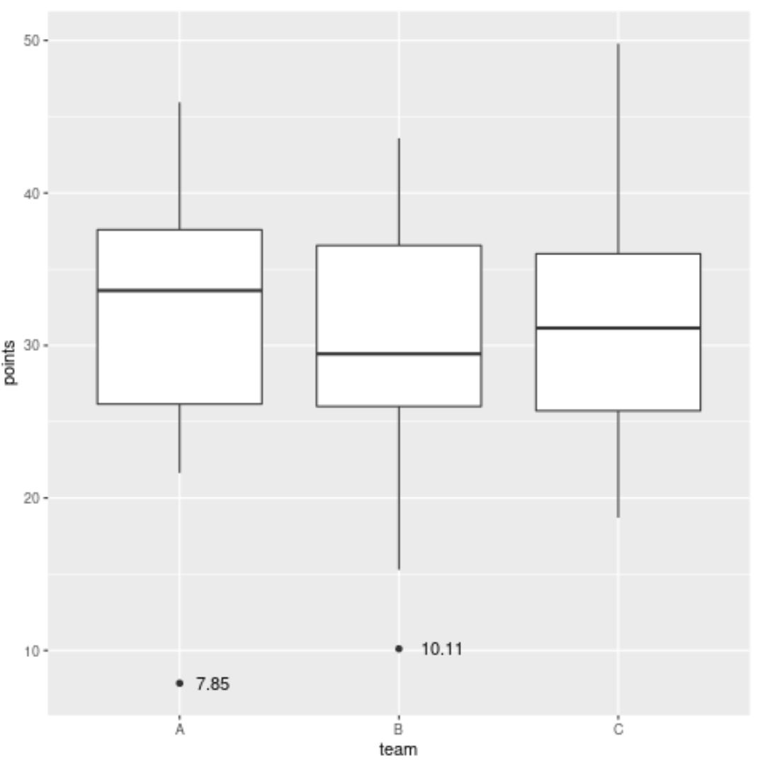
Notice that two outliers are labeled in the plot.
The first outlier is a player on team A who scored 7.85 points and the other outlier is a player on team B who scored 10.11 points.
Note that we could also use a different variable to label these outliers.
For example, we could swap out points for player in the mutate() function to instead label the outliers based on the player name:
library(ggplot2)
library(dplyr)

#add new column to data frame that indicates if each observation is an outlier
df %
        group_by(team) %>%
        mutate(outlier = ifelse(find_outlier(points), player, NA))

#create box plot of points by team and label outliers
ggplot(df, aes(x=team, y=points)) +
  geom_boxplot() +
geom_text(aes(label=outlier), na.rm=TRUE, hjust=-.5) 
The outlier on team A now has a label of N and the outlier on team B now has a label of D, since these represent the player names who have outlier values for points.
Note: The hjust argument in geom_text() is used to push the label horizontally to the right so that it doesn’t overlap the dot in the plot.
Additional Resources
The following tutorials explain how to perform other common tasks in ggplot2:
How to Change Font Size in ggplot2
How to Remove a Legend in ggplot2
How to Rotate Axis Labels in ggplot2