You can use proc sgplot to create line plots in SAS.
This procedure uses the following basic syntax:
/*create dataset*/
proc sgplot data=my_data;
    series x=x_variable y=y_variable;
run;
The following examples show how to use this procedure to create line plots in SAS.
Example 1: Create Line Plot with One Line
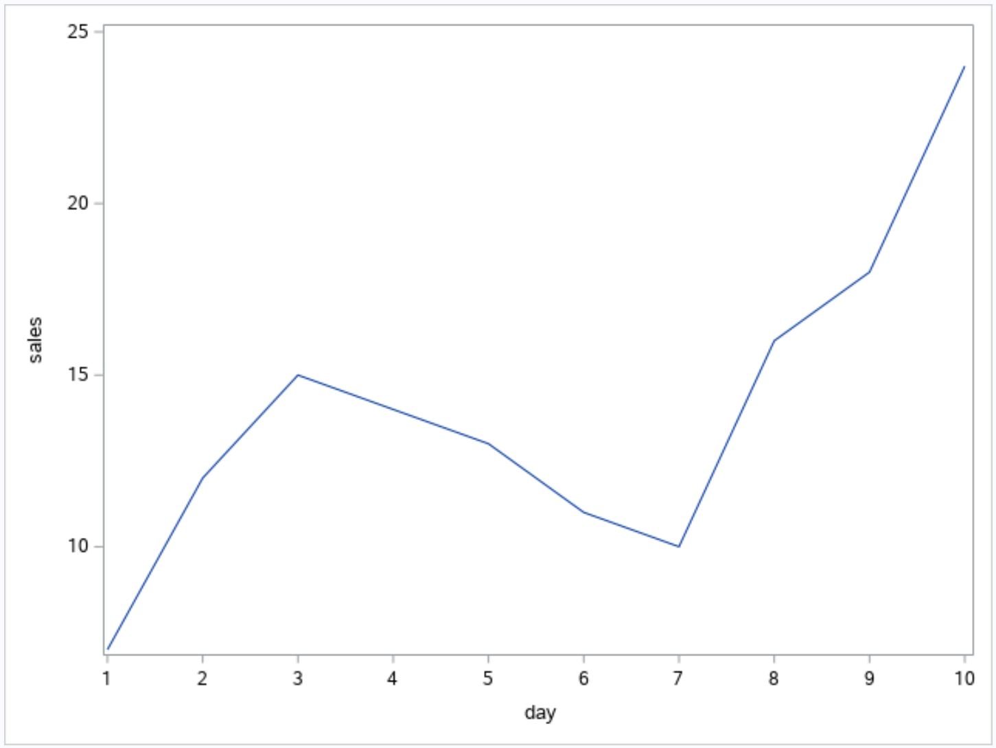
Suppose we have the following dataset in SAS that shows the total sales made by a store during 10 consecutive days:
/*create dataset*/
data my_data;
    input day $ sales;
    datalines;
1 7
2 12
3 15
4 14
5 13
6 11
7 10
8 16
9 18
10 24
;
run;

/*view dataset*/
proc print data=my_data;

We can use proc sgplot to create a line plot that displays the day on the x-axis and sales on the y-axis:
/*create line plot that displays sales by day*/
proc sgplot data=my_data;
    series x=day y=sales;
run;
We can use the following code to modify the appearance of the chart, including the title, labels, colors, line pattern, and line thickness:
/*create custom line plot*/
title "Sales by Day";
proc sgplot data=my_data;
    series x=day y=sales / lineattrs=(color=red pattern=dash thickness=4);
    xaxis display=(nolabel noline noticks);
run;
title; 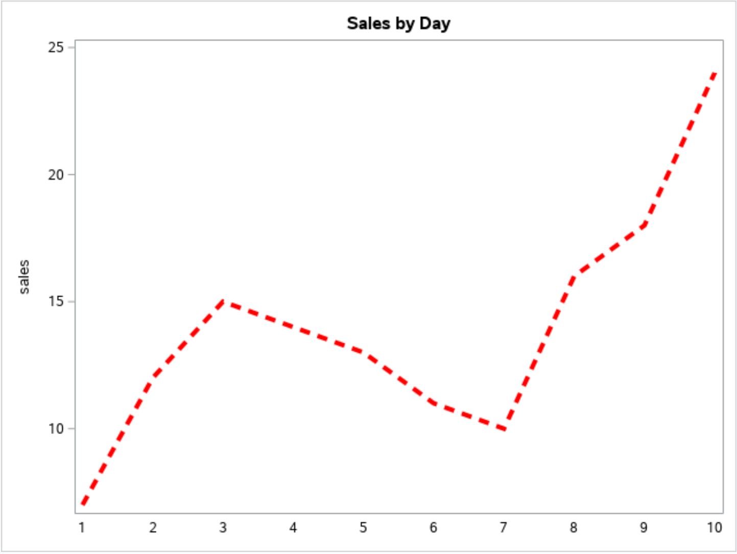
Example 2: Create Line Plot with Multiple Lines
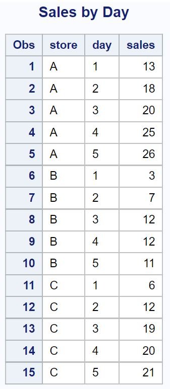
Suppose we have the following dataset in SAS that shows the total sales made by three different stores during five consecutive days:
/*create dataset*/
data my_data;
    input store $ day $ sales;
    datalines;
A 1 13
A 2 18
A 3 20
A 4 25
A 5 26
B 1 3
B 2 7
B 3 12
B 4 12
B 5 11
C 1 6
C 2 12
C 3 19
C 4 20
C 5 21
;
run;

/*view dataset*/
proc print data=my_data;
We can use proc sgplot with the group argument to create a line plot that displays the sales made by each of the three stores:
/*create line plot that displays sales by day for each store*/
title "Sales by Day by Store";
proc sgplot data=my_data;
    styleattrs datacontrastcolors=(red green blue);
    series x=day y=sales / group=store;
run;
title; 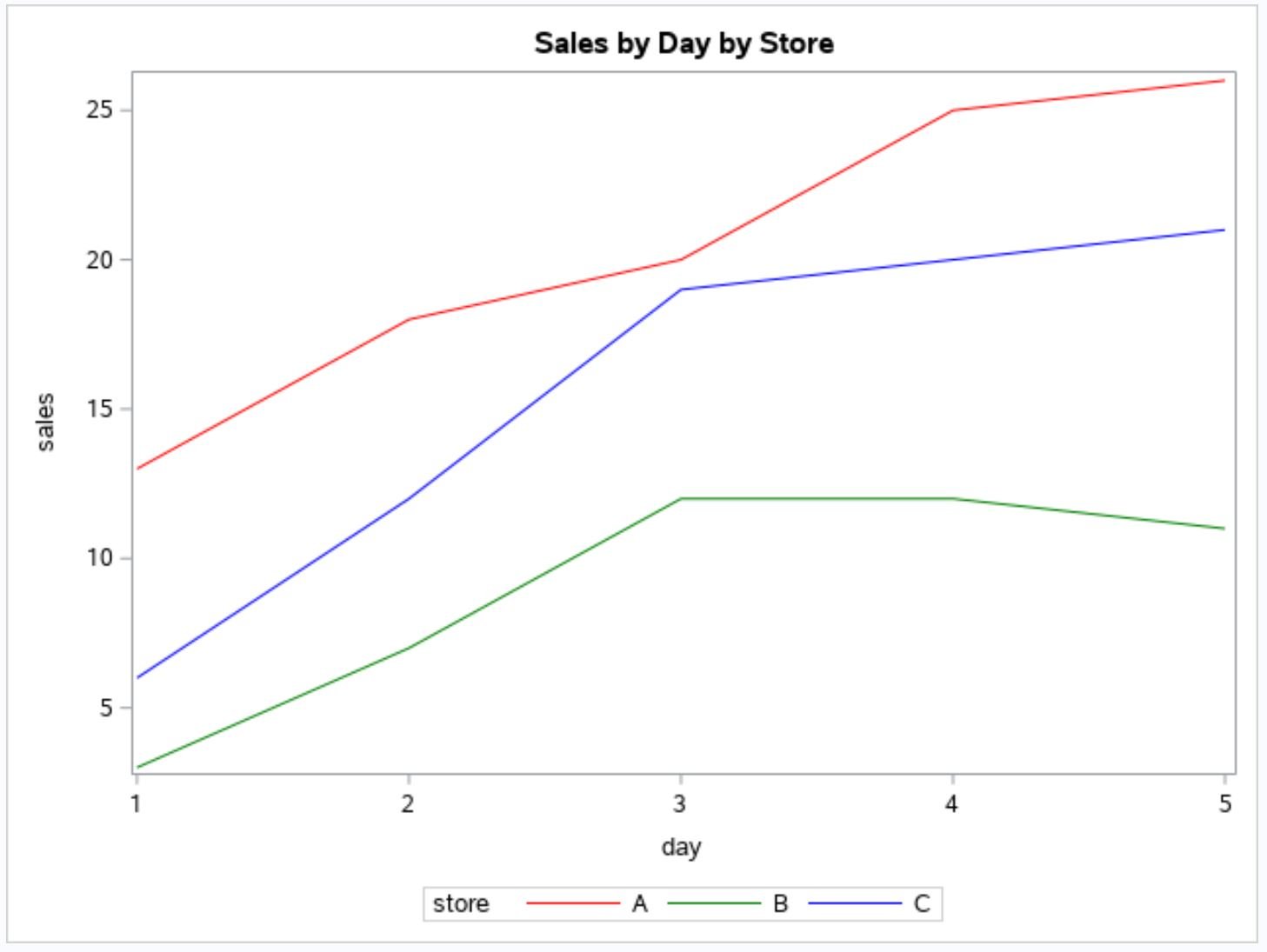
The x-axis displays the day and the y-axis displays the sales made by the stores.
The three individual lines show the sales made by each of the three stores during each day.
Additional Resources
The following tutorials explain how to create other common visualizations in SAS:
How to Create Boxplots by Group in SAS
How to Create a Scatterplot with Regression Line in SAS