A contour plot is a type of plot that allows us to visualize three-dimensional data in two dimensions by using contours.
You can create a contour plot in Matplotlib by using the following two functions:
- matplotlib.pyplot.contour() – Creates contour plots.
- matplotlib.pyplot.contourf() – Creates filled contour plots.
The following examples show how to use these two functions in practice.
Example 1: Contour Plot in Matplotlib
Suppose we have the following data in Python:
import numpy as np

x = np.linspace(0, 5, 50)
y = np.linspace(0, 5, 40)

X, Y = np.meshgrid(x, y)
Z = np.sin(X*2+Y)*3 + np.cos(Y+5)
We can use the following code to create a contour plot for the data:
import matplotlib.pyplot as plt

plt.contour(X, Y, Z, colors='black')

When a single color is used for the plot, the dashed lines represent negative values and the solid lines represent positive values.
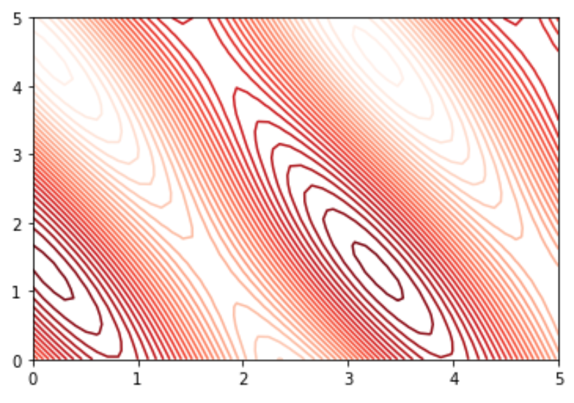
An alternative is to specify a colormap using the cmap argument. We can also specify more lines to be used in the plot with the levels argument:
plt.contour(X, Y, Z, levels=30, cmap='Reds')

We chose to use the cmap ‘Reds’ but you can find a complete list of colormap options on the Matplotlib documentation page.
Example 2: Filled Contour Plot in Matplotlib
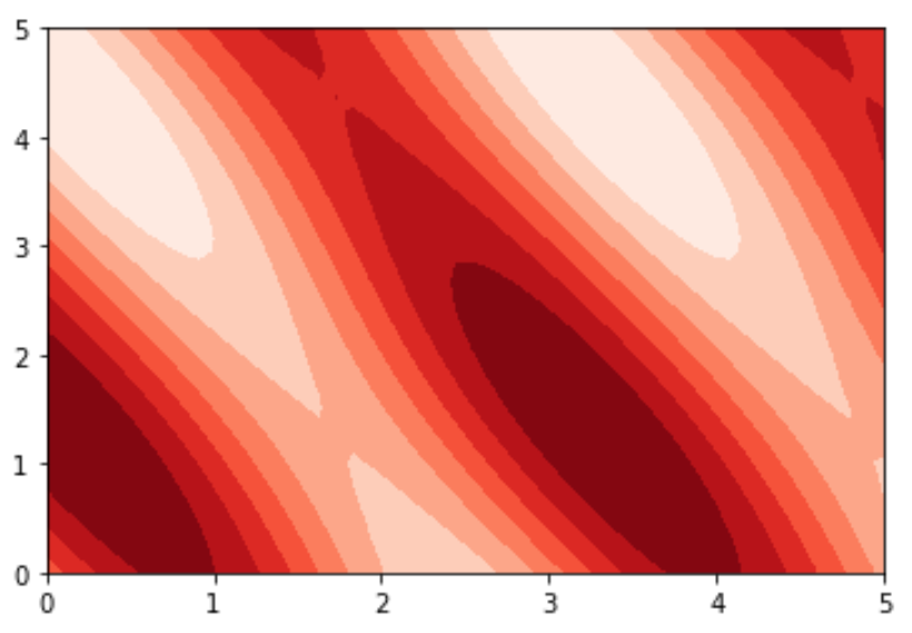
A filled contour plot is similar to a contour plot except that the spaces between the lines are filled.
The following code shows how to use the contourf() function to create a filled contour plot for the same data we used in the previous example:
plt.contourf(X, Y, Z, cmap='Reds')

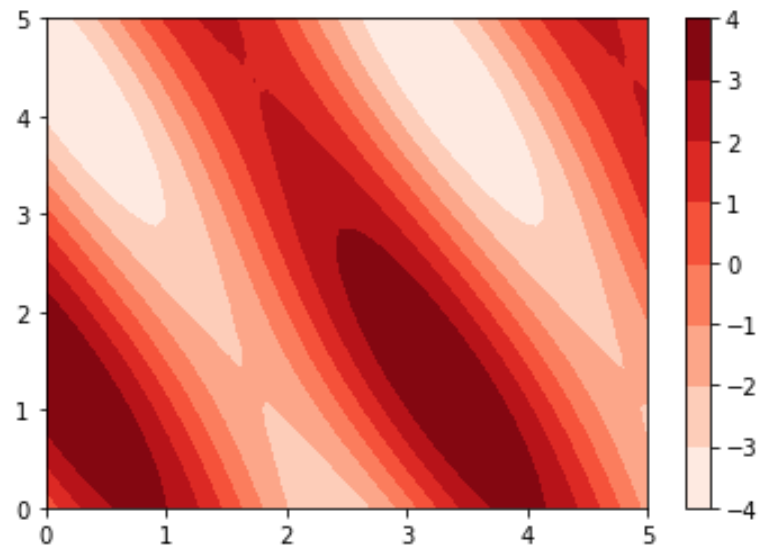
We can also use the colorbar() function to add a labeled color bar next to the plot:
plt.contourf(X, Y, Z, cmap='Reds')
plt.colorbar()

You can find more Matplotlib tutorials here.
