This step-by-step tutorial explains how to plot the following Chi-Square distribution in Excel:

Step 1: Define the X Values
First, let’s define a range of x-values to use for our plot.
For this example, we’ll create a range from 0 to 20:

Step 2: Calculate the Y Values
The y values on the plot will represent the PDF values associated with the Chi-Square distribution.
We can type the following formula into cell B2 to calculate the PDF value of the Chi-Square distribution associated with an x value of 0 and a degrees of freedom value of 3:
=CHISQ.DIST(A2, $E$1, FALSE)
We can then copy and paste this formula down to every remaining cell in column B:

Step 3: Plot the Chi-Square Distribution
Next, highlight the cell range A2:B22, then click the Insert tab along the top ribbon, then click the Scatter option within the Charts group and click Scatter with Smooth Lines:

The following chart will be created:
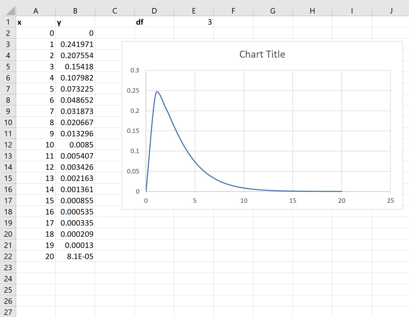
The x-axis shows the values of a random variable that follows a Chi-Square distribution with 3 degrees of freedom and the y-axis shows the corresponding PDF values of the Chi-Square distribution.
Note that if you change the value for the degrees of freedom in cell E1, the chart will automatically update.
For example, we could change the degrees of freedom to 7:
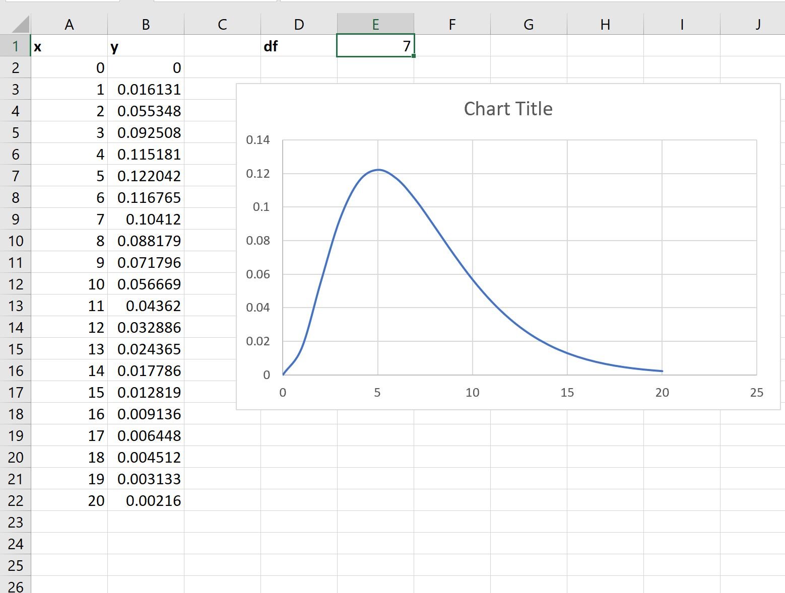
Notice that the shape of the plot automatically changes to reflect a Chi-Square distribution with 7 degrees of freedom.
Step 4: Modify the Appearance of the Plot
Feel free to add a title, axis labels, and remove the gridlines to make the plot more aesthetically pleasing:
Additional Resources
The following tutorials explain how to plot other common distributions in Excel:
How to Plot a Bell Curve in Excel
How to Plot a Binomial Distribution in Excel
How to Plot a Poisson Distribution in Excel