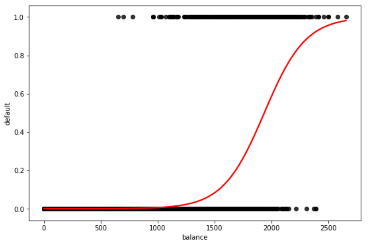
You can use the regplot() function from the seaborn data visualization library to plot a logistic regression curve in Python:
import seaborn as sns

sns.regplot(x=x, y=y, data=df, logistic=True, ci=None)
The following example shows how to use this syntax in practice.
Example: Plotting a Logistic Regression Curve in Python
For this example, we’ll use the Default dataset from the Introduction to Statistical Learning book. We can use the following code to load and view a summary of the dataset:
#import dataset from CSV file on Github
url = "https://raw.githubusercontent.com/Statology/Python-Guides/main/default.csv"
data = pd.read_csv(url)

#view first six rows of dataset
data[0:6]

        default	student	balance	        income
0	0	0	729.526495	44361.625074
1	0	1	817.180407	12106.134700
2	0	0	1073.549164	31767.138947
3	0	0	529.250605	35704.493935
4	0	0	785.655883	38463.495879
5	0	1	919.588530	7491.558572
This dataset contains the following information about 10,000 individuals:
- default: Indicates whether or not an individual defaulted.
- student: Indicates whether or not an individual is a student.
- balance: Average balance carried by an individual.
- income: Income of the individual.
Suppose we would like to build a logistic regression model that uses “balance” to predict the probability that a given individual defaults.
We can use the following code to plot a logistic regression curve:
#define the predictor variable and the response variable
x = data['balance']
y = data['default']

#plot logistic regression curve
sns.regplot(x=x, y=y, data=data, logistic=True, ci=None) 
The x-axis shows the values of the predictor variable “balance” and the y-axis displays the predicted probability of defaulting.
We can clearly see that higher values of balance are associated with higher probabilities that an individual defaults.
Note that you can also use scatter_kws and line_kws to modify the colors of the points and the curve in the plot:
#define the predictor variable and the response variable
x = data['balance']
y = data['default']

#plot logistic regression curve with black points and red line
sns.regplot(x=x, y=y, data=data, logistic=True, ci=None),
scatter_kws={'color': 'black'}, line_kws={'color': 'red'}) 
Feel free to choose whichever colors you’d like in the plot.
Additional Resources
The following tutorials provide additional information about logistic regression:
Introduction to Logistic Regression
How to Report Logistic Regression Results
How to Perform Logistic Regression in Python (Step-by-Step)
