Often you may want to plot a time series in R to visualize how the values of the time series are changing over time.
This tutorial explains how to quickly do so using the data visualization library ggplot2.
Basic Time Series Plot in R
Suppose we have the following dataset in R:
#create dataset
df as.Date("2021-01-01") - 0:99,
                 sales = runif(100, 10, 500) + seq(50, 149)^2)

#view first six rows
head(df)

        date    sales
1 2021-01-01 2845.506
2 2020-12-31 2837.849
3 2020-12-30 3115.517
4 2020-12-29 2847.161
5 2020-12-28 3374.619
6 2020-12-27 3182.005
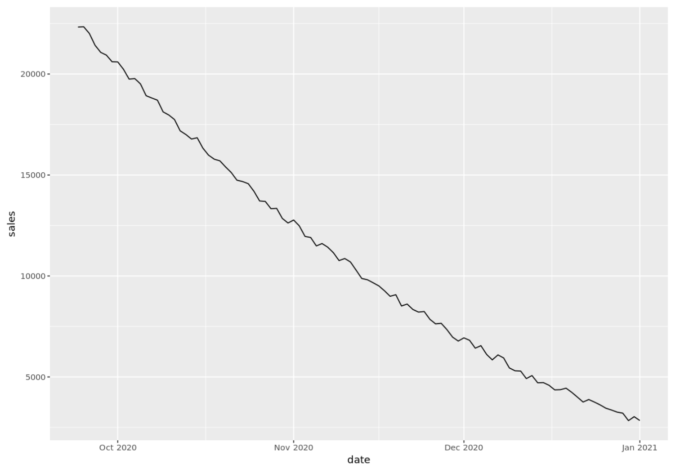
We can use the following code to create a basic time series plot for this dataset using ggplot2:
library(ggplot2)

#create time series plot
p aes(x=date, y=sales)) +
       geom_line()

#display time series plot
p

Format the Dates on the X-Axis
We can use the scale_x_date() function* to format the dates shown along the x-axis of the plot. This function takes the following arguments:
- %d: Day as a number between 0 and 31
- %a: Abbreviated weekday (e.g. “Tue”)
- %A: Unabbreviated weekday (e.g. “Tuesday”)
- %m: Month between 0 and 12
- %b: Abbreviated month (e.g. “Jan”)
- %B: Unabbreviated month (e.g. “January”)
- %y: 2-digit year (e.g. “21”)
- %Y: 4-digit year (e.g. “2021”)
- %W: Week of the year between 0 and 52
*In order for this function to work, the x-axis variable must be a date variable. If it is not already one, you can quickly convert it to one by using as.Date(variable_name).
The following code shows how to use one of these formats in practice:
p + scale_x_date(date_labels = "%b %Y")
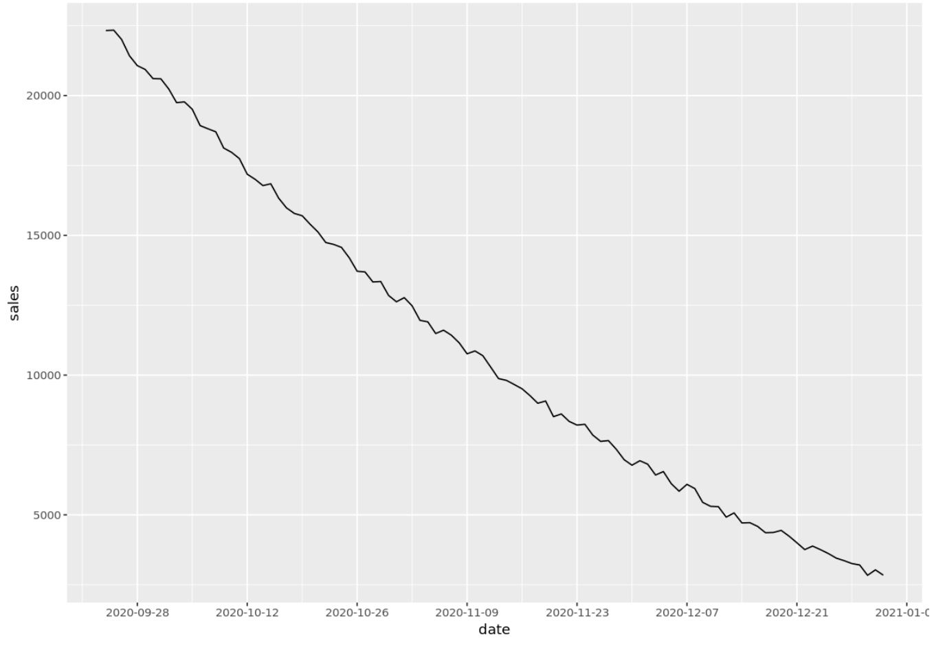
You can also add more frequent (or infrequent) breaks along the x-axis by using the date_breaks argument. For example, we could display the dates for every two weeks along the x-axis:
p + scale_x_date(date_breaks = "2 week")
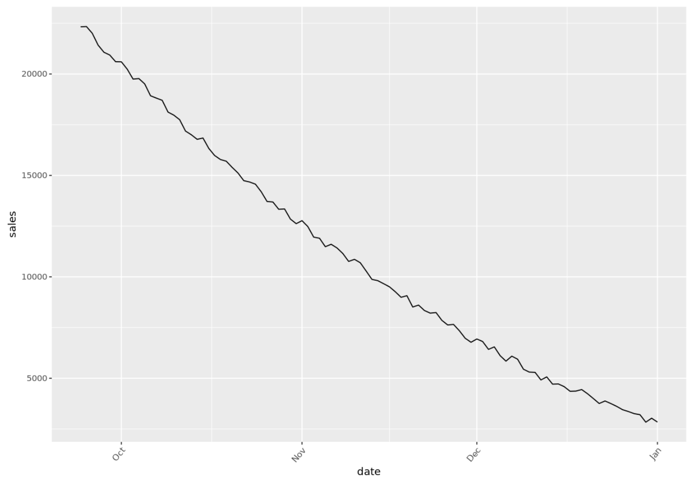
We can also easily angle the x-axis labels by using the following argument:
p + theme(axis.text.x=element_text(angle=50, hjust=1))
Lastly, we can change the theme, the axes labels, and the title to make the time series plot more visually appealing:
p aes(x=date, y=sales)) +
       geom_line(color="turquoise4") +
       theme_minimal() +
       labs(x="", y="Sales", title="Total Sales (Past 100 Days)") +
       theme(plot.title = element_text(hjust=0.5, size=20, face="bold"))

p 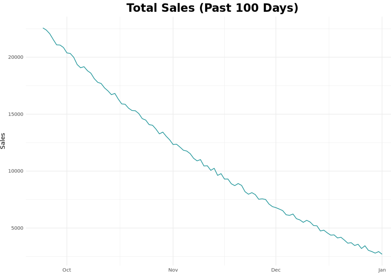
Additional Resources
A Complete Guide to the Best ggplot2 Themes
The Complete Guide to ggplot2 Titles
How to Create Side-by-Side Plots in ggplot2