A Q-Q plot, short for “quantile-quantile” plot, is often used to assess whether or not a set of data potentially came from some theoretical distribution.
In most cases, this type of plot is used to determine whether or not a set of data follows a normal distribution.
This tutorial explains how to create a Q-Q plot for a set of data in Python.
Example: Q-Q Plot in Python
Suppose we have the following dataset of 100 values:
import numpy as np

#create dataset with 100 values that follow a normal distribution
np.random.seed(0)
data = np.random.normal(0,1, 1000)

#view first 10 values
data[:10]

array([ 1.76405235,  0.40015721,  0.97873798,  2.2408932 ,  1.86755799,
       -0.97727788,  0.95008842, -0.15135721, -0.10321885,  0.4105985 ])
To create a Q-Q plot for this dataset, we can use the qqplot() function from the statsmodels library:
import statsmodels.api as sm
import matplotlib.pyplot as plt

#create Q-Q plot with 45-degree line added to plot
fig = sm.qqplot(data, line='45')
plt.show()

In a Q-Q plot, the x-axis displays the theoretical quantiles. This means it doesn’t show your actual data, but instead it represents where your data would be if it were normally distributed.
The y-axis displays your actual data. This means that if the data values fall along a roughly straight line at a 45-degree angle, then the data is normally distributed.
We can see in our Q-Q plot above that the data values tend to closely follow the 45-degree, which means the data is likely normally distributed. This shouldn’t be surprising since we generated the 100 data values by using the numpy.random.normal() function.
Consider instead if we generated a dataset of 100 uniformally distributed values and created a Q-Q plot for that dataset:
#create dataset of 100 uniformally distributed values
data = np.random.uniform(0,1, 1000)

#generate Q-Q plot for the dataset
fig = sm.qqplot(data, line='45')
plt.show()
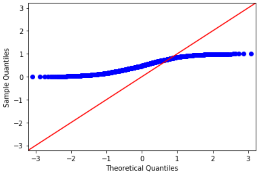
The data values clearly do not follow the red 45-degree line, which is an indication that they do not follow a normal distribution.
Notes on Q-Q Plots
Keep in mind the following notes about Q-Q plots:
- Although a Q-Q plot isn’t a formal statistical test, it offers an easy way to visually check whether or not a data set is normally distributed.
- Be careful not to confuse Q-Q plots with P-P plots, which are less commonly used and not as useful for analyzing data values that fall on the extreme tails of the distribution.
You can find more Python tutorials here.