A frequency table is a table that displays information about frequencies. Frequencies simply tell us how many times a certain event has occurred.
For example, the following table shows how many items a shop sold in different price ranges in a given week:
| Item Price | Frequency |
|---|---|
| $1 – $10 | 20 |
| $11 – $20 | 21 |
| $21 – $30 | 13 |
| $31 – $40 | 8 |
| $41 – $50 | 4 |
The first column displays the price class and the second column displays the frequency of that class.
It’s also possible to calculate the relative frequency for each class, which is simply the frequency of each class as a percentage of the whole.
| Item Price | Frequency | Relative Frequency |
|---|---|---|
| $1 – $10 | 20 | 0.303 |
| $11 – $20 | 21 | 0.318 |
| $21 – $30 | 13 | 0.197 |
| $31 – $40 | 8 | 0.121 |
| $41 – $50 | 4 | 0.061 |
In total, there were 66 items sold. Thus, we found the relative frequency of each class by taking the frequency of each class and dividing by the total items sold.
For example, there were 20 items sold in the price range of $1 – $10. Thus, the relative frequency of the class $1 – $10 is 20 / 66 = 0.303.
Next, there were 21 items sold in the price range of $11 – $20. Thus, the relative frequency of the class $11 – $20 is 21 / 66 = 0.318.
The following example illustrates how to find relative frequencies in Excel.
Example: Relative Frequencies in Excel
First, we will enter the class and the frequency in columns A and B:

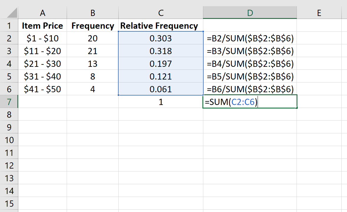
Next, we will calculate the relative frequency of each class in column C. Column D shows the formulas we used:

We can verify that our calculations are correct by making sure the sum of the relative frequencies adds up to 1:

We can also create a relative frequency histogram to visualize the relative frequencies.
Simply highlight the relative frequencies:

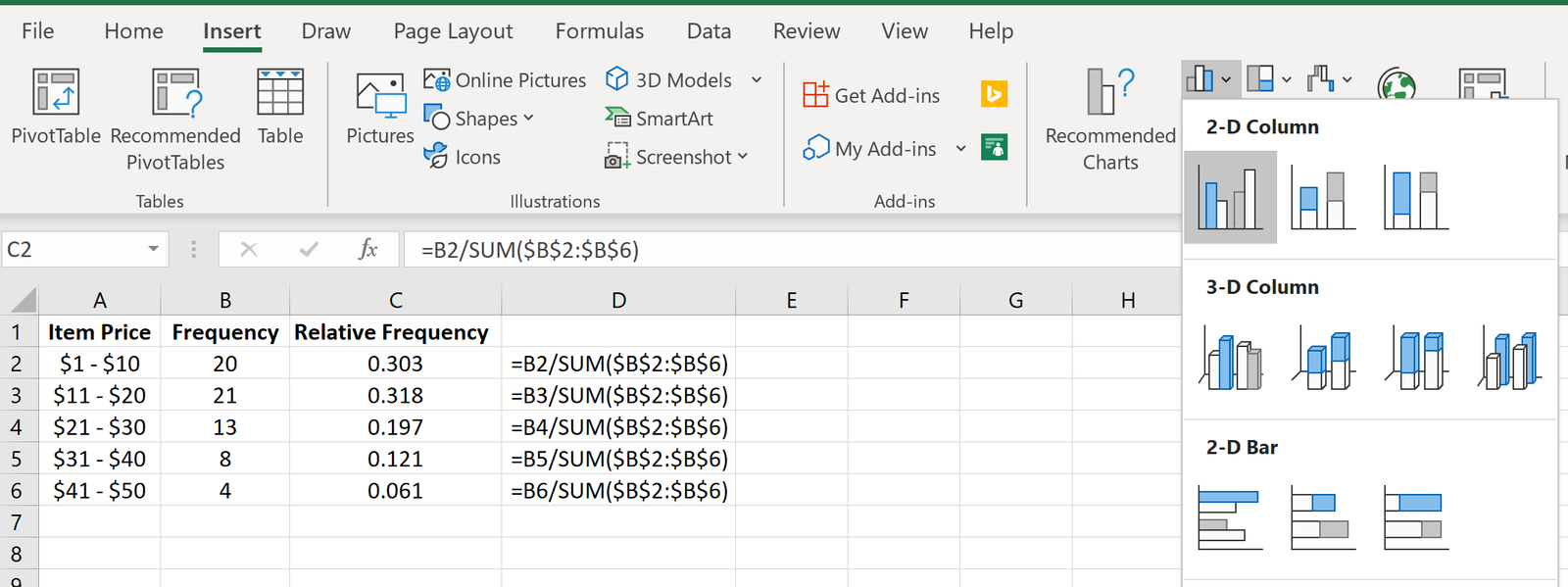
Then go to the Charts group in the Insert tab and click the first chart type in Insert Column or Bar Chart:

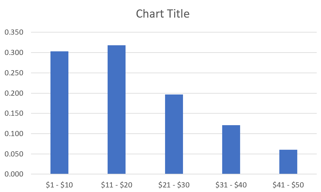
A relative frequency histogram will automatically appear:

Modify the x-axis labels by right-clicking on the chart and clicking Select Data. Under Horizontal (Category) Axis Labels click Edit and type in the cell range that contains the item prices. Click OK and the new axis labels will automatically appear:

Additional Resources
Relative Frequency Calculator
Relative Frequency Histogram: Definition + Example
