A residual plot is a type of plot that displays the fitted values against the residual values for a regression model.
This type of plot is often used to assess whether or not a linear regression model is appropriate for a given dataset and to check for heteroscedasticity of residuals.
This tutorial explains how to create a residual plot for a linear regression model in Python.
Example: Residual Plot in Python
For this example we’ll use a dataset that describes the attributes of 10 basketball players:
import numpy as np
import pandas as pd

#create dataset
df = pd.DataFrame({'rating': [90, 85, 82, 88, 94, 90, 76, 75, 87, 86],
                   'points': [25, 20, 14, 16, 27, 20, 12, 15, 14, 19],
                   'assists': [5, 7, 7, 8, 5, 7, 6, 9, 9, 5],
                   'rebounds': [11, 8, 10, 6, 6, 9, 6, 10, 10, 7]})

#view dataset
df

	rating	points	assists	rebounds
0	90	25	5	11
1	85	20	7	8
2	82	14	7	10
3	88	16	8	6
4	94	27	5	6
5	90	20	7	9
6	76	12	6	6
7	75	15	9	10
8	87	14	9	10
9	86	19	5	7
Residual Plot for Simple Linear Regression
Suppose we fit a simple linear regression model using points as the predictor variable and rating as the response variable:
#import necessary libraries
import matplotlib.pyplot as plt
import statsmodels.api as sm
from statsmodels.formula.api import ols

#fit simple linear regression model
model = ols('rating ~ points', data=df).fit()

#view model summary
print(model.summary())
We can create a residual vs. fitted plot by using the plot_regress_exog() function from the statsmodels library:
#define figure size
fig = plt.figure(figsize=(12,8))

#produce regression plots
fig = sm.graphics.plot_regress_exog(model, 'points', fig=fig)

Four plots are produced. The one in the top right corner is the residual vs. fitted plot. The x-axis on this plot shows the actual values for the predictor variable points and the y-axis shows the residual for that value.
Since the residuals appear to be randomly scattered around zero, this is an indication that heteroscedasticity is not a problem with the predictor variable.
Residual Plots for Multiple Linear Regression
Suppose we instead fit a multiple linear regression model using assists and rebounds as the predictor variable and rating as the response variable:
#fit multiple linear regression model
model = ols('rating ~ assists + rebounds', data=df).fit()

#view model summary
print(model.summary())
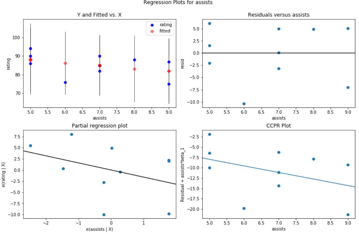
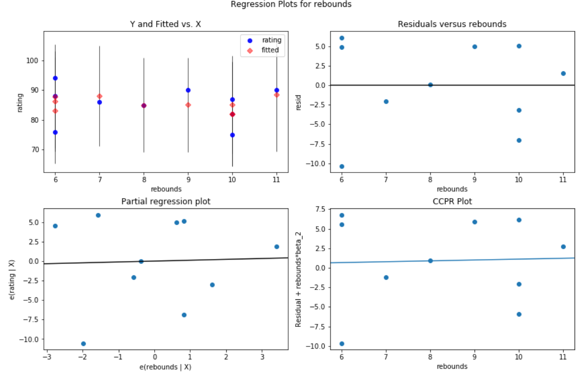
Once again we can create a residual vs. predictor plot for each of the individual predictors using the plot_regress_exog() function from the statsmodels library.
For example, here’s what the residual vs. predictor plot looks like for the predictor variable assists:
#create residual vs. predictor plot for 'assists'
fig = plt.figure(figsize=(12,8))
fig = sm.graphics.plot_regress_exog(model, 'assists', fig=fig)

And here’s what the residual vs. predictor plot looks like for the predictor variable rebounds:
#create residual vs. predictor plot for 'assists'
fig = plt.figure(figsize=(12,8))
fig = sm.graphics.plot_regress_exog(model, 'rebounds', fig=fig)

In both plots the residuals appear to be randomly scattered around zero, which is an indication that heteroscedasticity is not a problem with either predictor variable in the model.
