Boxplots are useful for quickly visualizing the five-number summary of a dataset, which includes:
- The minimum value
- The first quartile
- The median
- The third quartile
- The maximum value
The following example shows how to create grouped boxplots in SAS to visualize the distribution of several groups at once.
Example: Create Boxplots by Group in SAS
First, let’s create a dataset in SAS that contains three different groups:
/*create dataset*/
data my_data;
    input Group $ Value;
    datalines;
A 7
A 8
A 9
A 12
A 14
B 5
B 6
B 6
B 8
B 11
C 8
C 9
C 11
C 13
C 17
;
run;
Note that there are three different groups in this dataset: A, B, and C.
Next, we can use the following code to create boxplots by group:
/*create boxplots by group*/
proc sgplot data=my_data;
   vbox Value / group=Group;
   keylegend / title="Group Name";
run;
The result is three individual boxplots that display the distribution of data values for groups A, B, and C:

Related: How to Compare Box Plots
Note that you can use the hbox function to create horizontal boxplots instead:
/*create horizontal boxplots by group*/
proc sgplot data=my_data;
   hbox Value / group=Group;
   keylegend / title="Group Name";
run;
The result is three horizontal boxplots:
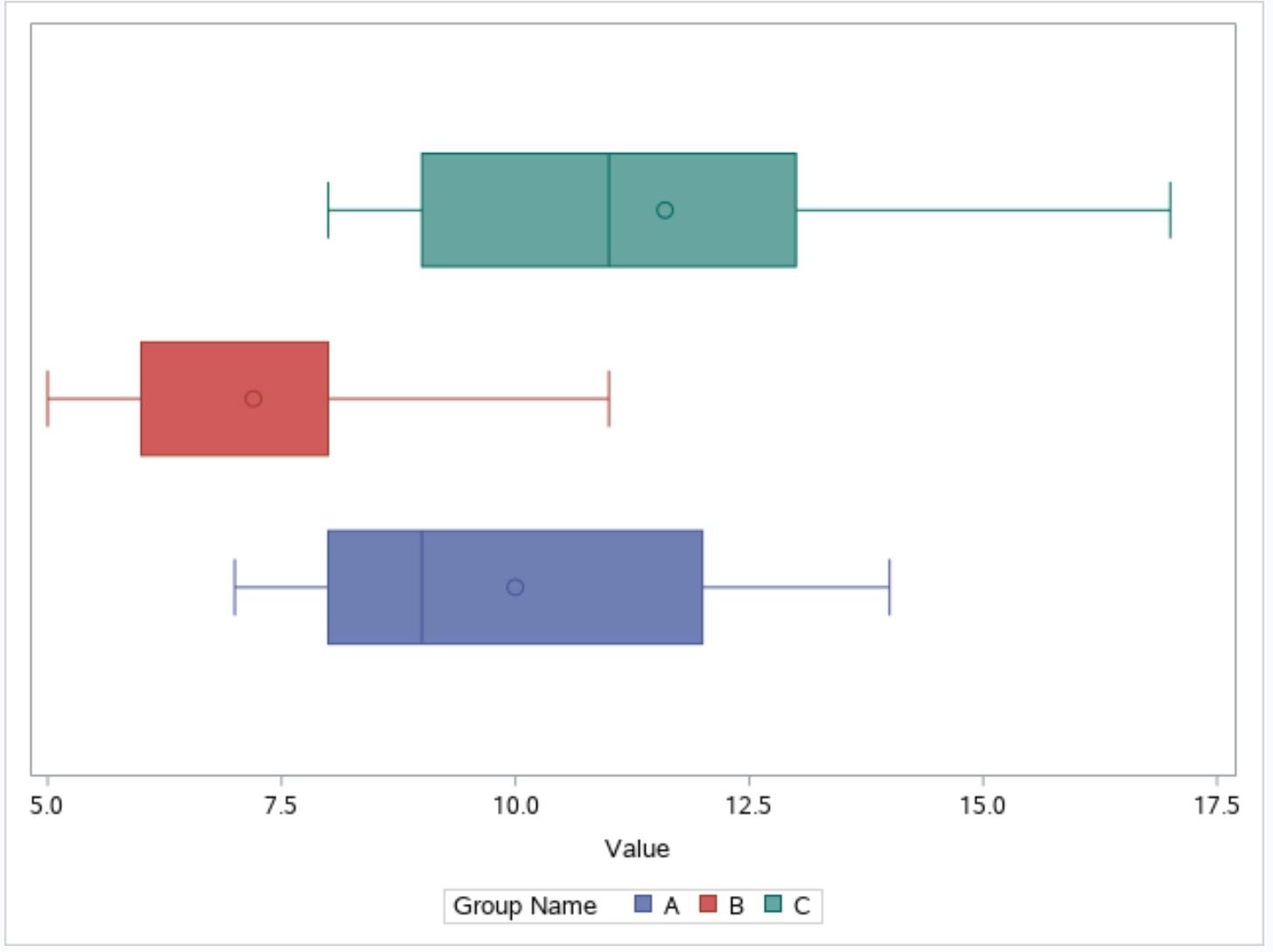
The legend at the bottom of the plot shows which color corresponds to each group.
Additional Resources
The following tutorials provide additional information about boxplots:
Introduction to Boxplots
Online Boxplot Generator
When Should You Use a Box Plot? (3 Scenarios)