You can use the following methods to create one or more histograms in SAS:
Method 1: Create One Histogram
proc univariate data=my_data;
    var var1;
    histogram var1;
run;
Method 2: Create Panel of Histograms
proc univariate data=my_data;
    class var2;
    var var1;
    histogram var1;
run;
Method 3: Overlay Histograms
proc univariate data=my_data;
    class var2;
    var var1;
    histogram var1 / overlay;
run;
The following examples show how to use each method with the following dataset in SAS:
/*create dataset*/
data my_data;
    input team $ points rebounds;
    datalines;
A 29 8
A 23 6
A 20 6
A 21 9
A 33 14
A 35 11
A 31 10
B 21 9
B 14 5
B 15 7
B 11 10
B 12 6
B 10 8
B 15 10
;
run;

/*view dataset*/
proc print data=my_data;

Example 1: Create One Histogram
The following code shows how to create one histogram for the points variable:
/*create histogram for points variable*/
proc univariate data=my_data;
    var points;
    histogram points;
run;
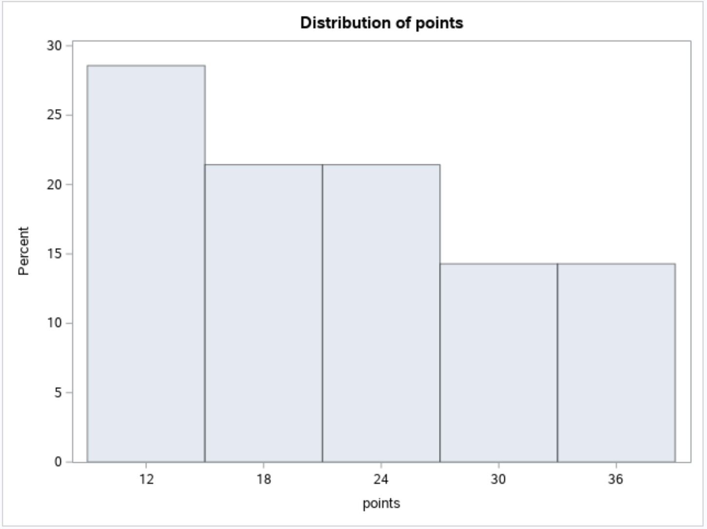
The x-axis displays the values for the points variable and the y-axis displays the percentage of observations in the dataset that fall into various values.
Example 2: Create Panel of Histograms
The following code shows how to create a panel of histograms to visualize the distribution of values for the points variable grouped by the team variable:
/*create histogram for points variable*/
proc univariate data=my_data;
    class team;
    var points;
    histogram points;
run; 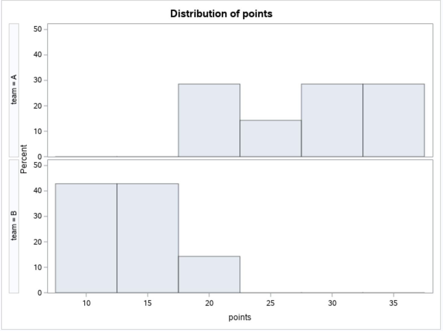
This plot allows us to quickly see that the players on team A tend to score more points than the players on team B.
Notice that the two histograms share an x-axis, which makes it easy to compare the points values between the two teams.
Method 3: Overlay Histograms
The following code shows how to overlay multiple histograms in one plot:
/*create histogram for points variable*/
proc univariate data=my_data;
    class team;
    var points;
    histogram points / overlay;
run; 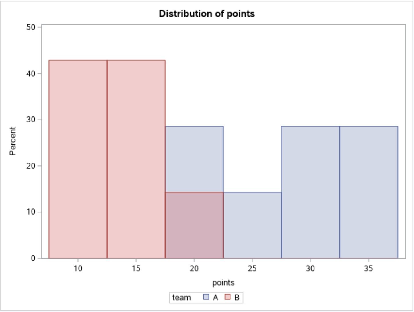
This type of plot is useful when you want to visualize multiple histograms in a single chart.
Additional Resources
The following tutorials explain how to create other charts in SAS:
How to Create Line Plots in SAS
How to Create Boxplots by Group in SAS
How to Create a Scatterplot with Regression Line in SAS