You can use the following methods to create scatter plots in SAS:
Method 1: Create One Scatter Plot
proc sgplot data=my_data;
    scatter x=var1 y=var2;
run;
Method 2: Create Scatter Plots by Group
proc sgplot data=my_data;
    scatter x=var1 y=var2 / group=var3;
run;
The following examples show how to use each method with the following dataset in SAS:
/*create dataset*/
data my_data;
    input team $ points rebounds;
    datalines;
A 29 8
A 23 6
A 20 6
A 21 9
A 33 14
A 35 11
A 31 10
B 21 9
B 14 5
B 15 7
B 11 10
B 12 6
B 10 8
B 15 10
;
run;

/*view dataset*/
proc print data=my_data;

Example 1: Create One Scatter Plot
The following code shows how to create a scatterplot for the points and rebounds variables:
proc sgplot data=my_data;
    scatter x=points y=rebounds;
run; 
The x-axis displays the values for the points variable and the y-axis displays the values for the rebounds variable.
Note that we can also add a title to the plot and modify the appearance of the markers within the plot to make it more aesthetically pleasing:
title "Points vs. Rebounds";
proc sgplot data=my_data;
    scatter x=points y=rebounds /
    markerattrs=(symbol=CircleFilled size=12 color=purple);
run; 
Example 2: Create Scatter Plots by Group
The following code shows how to create a scatterplot of points vs. rebounds in which the markers are colored based on team:
title "Points vs. Rebounds by Team";
proc sgplot data=my_data;
    scatter x=points y=rebounds /
    markerattrs=(symbol=CircleFilled size=12)
    group=team;
run; 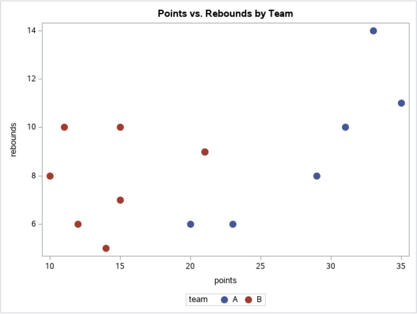
This plot allows us to quickly visualize the relationship between points and rebounds for both team A and team B.
Additional Resources
The following tutorials explain how to create other charts in SAS:
How to Create Line Plots in SAS
How to Create Histograms in SAS
How to Create Boxplots by Group in SAS
How to Create a Scatterplot with Regression Line in SAS