A scatter plot matrix is exactly what it sounds like – a matrix of scatterplots.
This type of matrix is useful because it allows you to visualize the relationship between multiple variables in a dataset at once.
You can use the following basic syntax to create a scatter plot matrix in SAS:
proc sgscatter data=my_data;
  matrix var1 var2 var3;
run;
This particular syntax creates a scatter plot matrix for the variables var1, var2, and var3 in the dataset called my_data.
The following example shows how to use this syntax in practice.
Example: Create Scatter Plot Matrix in SAS
Suppose we have the following dataset in SAS:
/*create dataset*/
data my_data;
    input team $ points assists rebounds;
    datalines;
A 22 12 8
A 20 18 4
A 14 9 5
A 30 16 10
B 10 4 3
B 9 5 12
B 6 5 14
B 14 10 5
C 4 8 12
C 13 10 5
C 11 12 8
C 19 3 2
;
run;

/*view dataset*/
proc print data=my_data; 
We can use the following syntax to create a scatter plot to visualize the relationship between the points, assists, and rebounds variables:
/*create scatter plot matrix*/
proc sgscatter data=my_data;
  matrix points assists rebounds;
run; 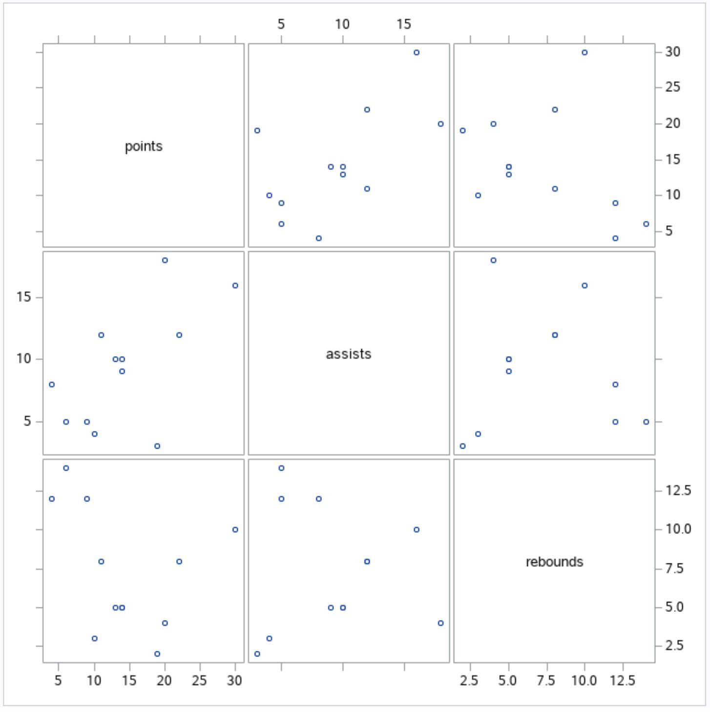
Note that we can also use the title function to add a title to the overall matrix and the group function to color the points in the plot based on the value for the team variable:
/*create scatter plot matrix with points colored by team*/
proc sgscatter data=my_data;
  title "Scatterplot Matrix";
  matrix points assists rebounds / group=team;
run;
title; 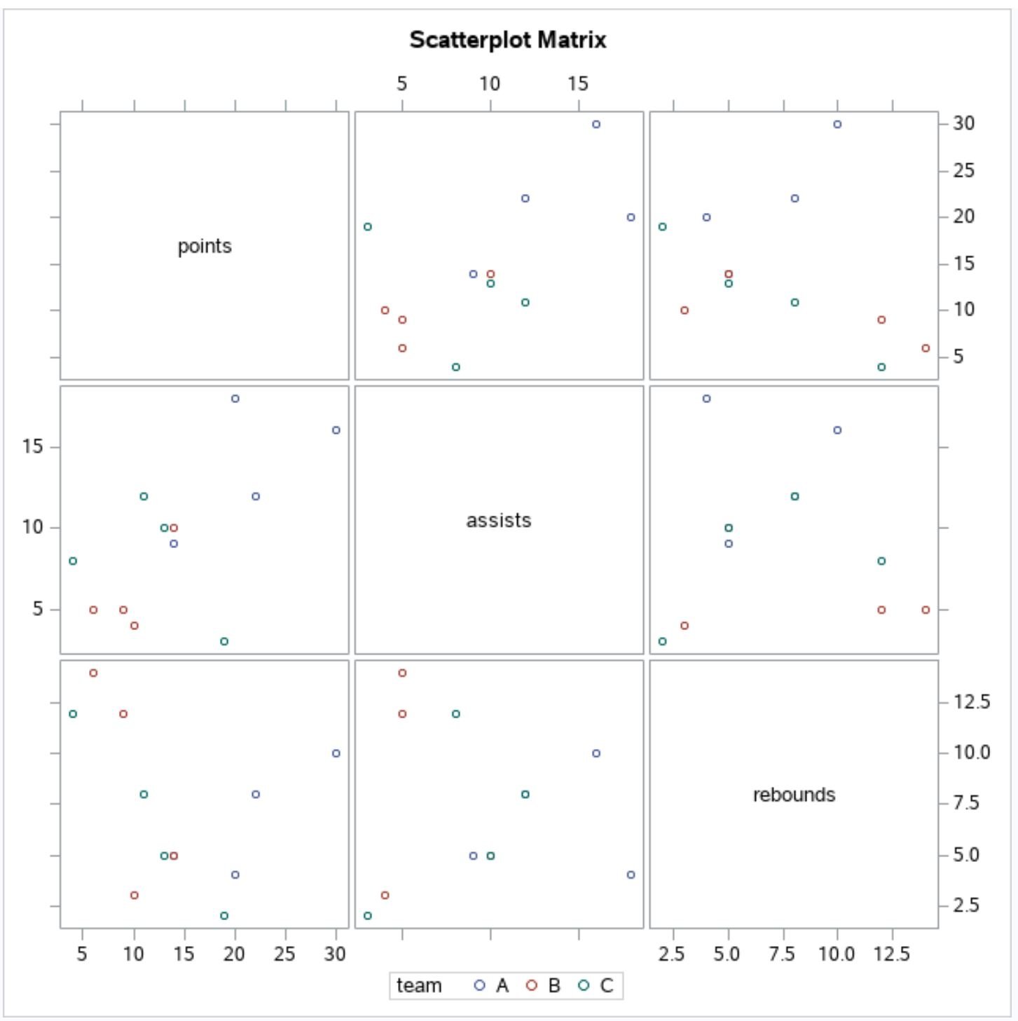
The scatter plot matrix now has a title and the points in each scatter plot are colored based on their team value.
Additional Resources
The following tutorials explain how to create other common charts in SAS:
How to Create Scatter Plots in SAS
How to Create Line Plots in SAS
How to Create Boxplots by Group in SAS