You can use the following methods to plot a normal distribution with the seaborn data visualization library in Python:
Method 1: Plot Normal Distribution Histogram
sns.displot(x)
Method 2: Plot Normal Distribution Curve
sns.displot(x, kind='kde')
Method 3: Plot Normal Distribution Histogram with Curve
sns.displot(x, kde=True)
The following examples show how to use each method in practice.
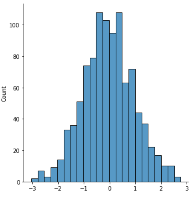
Example 1: Plot a Normal Distribution Histogram
The following code shows how to plot a normal distribution histogram in seaborn:
import numpy as np
import seaborn as sns

#make this example reproducible
np.random.seed(0)

#create data
x = np.random.normal(size=1000)

#create normal distribution histogram
sns.displot(x)

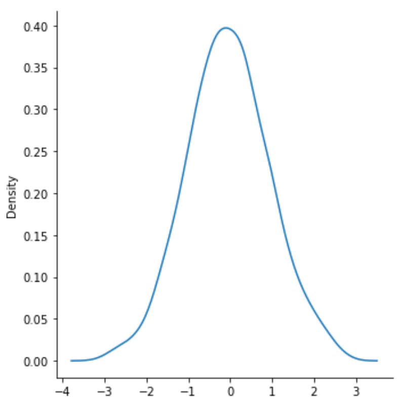
Example 2: Plot a Normal Distribution Curve
The following code shows how to plot a normal distribution curve in seaborn:
import numpy as np
import seaborn as sns

#make this example reproducible
np.random.seed(0)

#create data
x = np.random.normal(size=1000)

#create normal distribution curve
sns.displot(x, kind='kde')

Example 3: Plot a Normal Distribution Histogram with Curve
The following code shows how to plot a normal distribution histogram with a curve in seaborn:
import numpy as np
import seaborn as sns

#make this example reproducible
np.random.seed(0)

#create data
x = np.random.normal(size=1000)

#create normal distribution curve
sns.displot(x, kde=True)

Additional Resources
The following tutorials explain how to perform other common operations in seaborn:
How to Create Multiple Seaborn Plots in One Figure
How to Create an Area Chart in Seaborn
How to Create a Pie Chart in Seaborn
